How to read the HR diagram, the most important graph in astrophysics
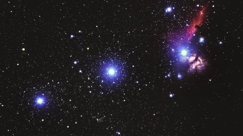
Credit: Alexander Andrews / Unsplash
- Just like people, stars are born, grow old, and die.
- Astrophysicists figured this out by studying stars’ brightness and temperatures.
- This data is beautifully and powerfully captured in the Hertzsprung-Russell (HR) diagram.
Stars are just like us! I don’t mean that in a “Dua Lipa likes to wear pajamas when she shops for milk” kind of way. What I’m talking about are life cycles.
Stars are born, live, and die. Just like us. That’s a pretty amazing fact in and of itself when you consider that for most of human history, folks thought stars were eternal and unchanging. Instead, stars change over the course of time, just like we do.
Last week, we took a first look at the Hertzsprung-Russell diagram (HR diagram), which is how astronomers discovered that stars have life cycles. I called it “the most important graph in astrophysics.” It’s so important that it deserves another look today. So, let’s take a deeper dive to see how it reveals the patterns of stellar biography.
Explaining the HR diagram

An HR diagram is a plot of stellar luminosity (energy output) on the vertical axis and stellar surface temperature on the horizonal axis. The major focus of the last post was the Main Sequence, which is the dense diagonal band that appears when you take a mess of stars and drop them onto this kind of plot.
Why was the appearance of the Main Sequence so important? An HR diagram is really a snapshot of a big collection of stars taken at random points in their lives. Say we go out one night and point our telescope at 100,000 stars and measure their luminosity (“L”) and their temperature (“T”). Based on those measured values of L and T, we drop each star onto their appropriate location in the diagram.
This is a lot like going to the mall and measuring the height (H) and weight (W) of random people you run into and then plotting the results on a Height vs. Weight plot. What do you think you would see if you collected H and W for 1000 random human beings.? The majority of your points would show humans with heights between 5 and 6 feet tall and weights between 100 and 250 pounds. Why? Because that’s the range of height and weight for middle-aged adults — and we all spend most of our lives in middle age (say, between 25 and 65).
But there are exceptions. You would also expect to see a cluster of really small heights and weights for babies and little kids. In addition, you would expect some medium heights and lower weights representing old people. But most people would fall on a band in your plot of H and W between (5 feet, 100 pounds) and (6 feet, 250 pounds).
Main Sequence: A star’s middle age

So, what then is the Main Sequence? It’s the place where the stars “live” on the HR diagram in their middle age. Boom! So simple and yet so profound. Stars change. Their properties change. They have life cycles, and that means that the place we expect to find most of them (in terms of their changing properties on the HR diagram) is where they spend most of their lives — that is, their middle ages.
What defines a star’s long middle age? It’s the period when they are burning hydrogen gas as a fuel for fusion. Stars support themselves against the gravitational crush of their own weight via thermonuclear fusion in their cores. Fusion occurs when light elements get squeezed into heavier elements, releasing a little energy in the process (via E = mc2). Since hydrogen is the most abundant and lightest element in the universe, it’s the first gas that gets fused in a star’s core. As long as stars have hydrogen to burn, you will find them on the Main Sequence.
Only after the hydrogen fuel for fusion runs out does a star face a kind of late-life crisis in which it must change its interior conditions to get the next element, helium, to start fusing. But once that happens, the star “moves” off the Main Sequence.
Another question is, “Why is the Main Sequence a diagonal band running from high L and T to low L and T?” The answer lies in the physics of nuclear fusion. High mass stars have a high gravitational crush in their centers, which raises their core temperatures. Nuclear fusion rates are crazy sensitive to temperature. That means massive stars burn their hydrogen hot and fast, producing huge energy outputs. So, the Main Sequence is also a sequence in stellar mass. The high-mass stars are up in the high L and T corner, while the low-mass stars are in the low L and T corner.
The rest of the HR diagram
What about those other collections of stars on the HR diagram? What are the “giants” and the “dwarves” telling us about the life cycles of stars? We’ll have to pick up that tale next time.