
How’s the air where you are? Perhaps check this website first before you take your next breath, because inhaling polluted air can be as bad for you as smoking a pack of cigarettes a day.
According to the World Health Organization, air pollution kills an estimated seven million people worldwide every year — yet another reason, apart from climate change, we need to stop emitting CO2 and other noxious gases.

It’s not like we can’t, or that it doesn’t make a difference if we do. When the pandemic began, lockdowns virtually eliminated traffic-based emissions for a while — lifting the seemingly permanent veil of smog from many cities around the world.
As economies recover from the worst of the pandemic, emissions have crept up again. Yet some cities seem to have learned lessons from the virus-induced emission intermission in early 2020. This map, produced by energy experts Uswitch, shows the 10 European capitals that have managed to improve their air quality the most from 2019 to 2021. Most realized gains in the double digits. Athens managed to improve its air quality by more than a third, Dublin by almost a quarter.
Unfortunately, not all cities went in the same direction. Uswitch also looked at the European capitals that saw the largest increases in air pollutants. Reykjavik’s air became almost 14% dirtier between 2019 and 2021, while Budapest’s was not that far behind, with more than 12%.
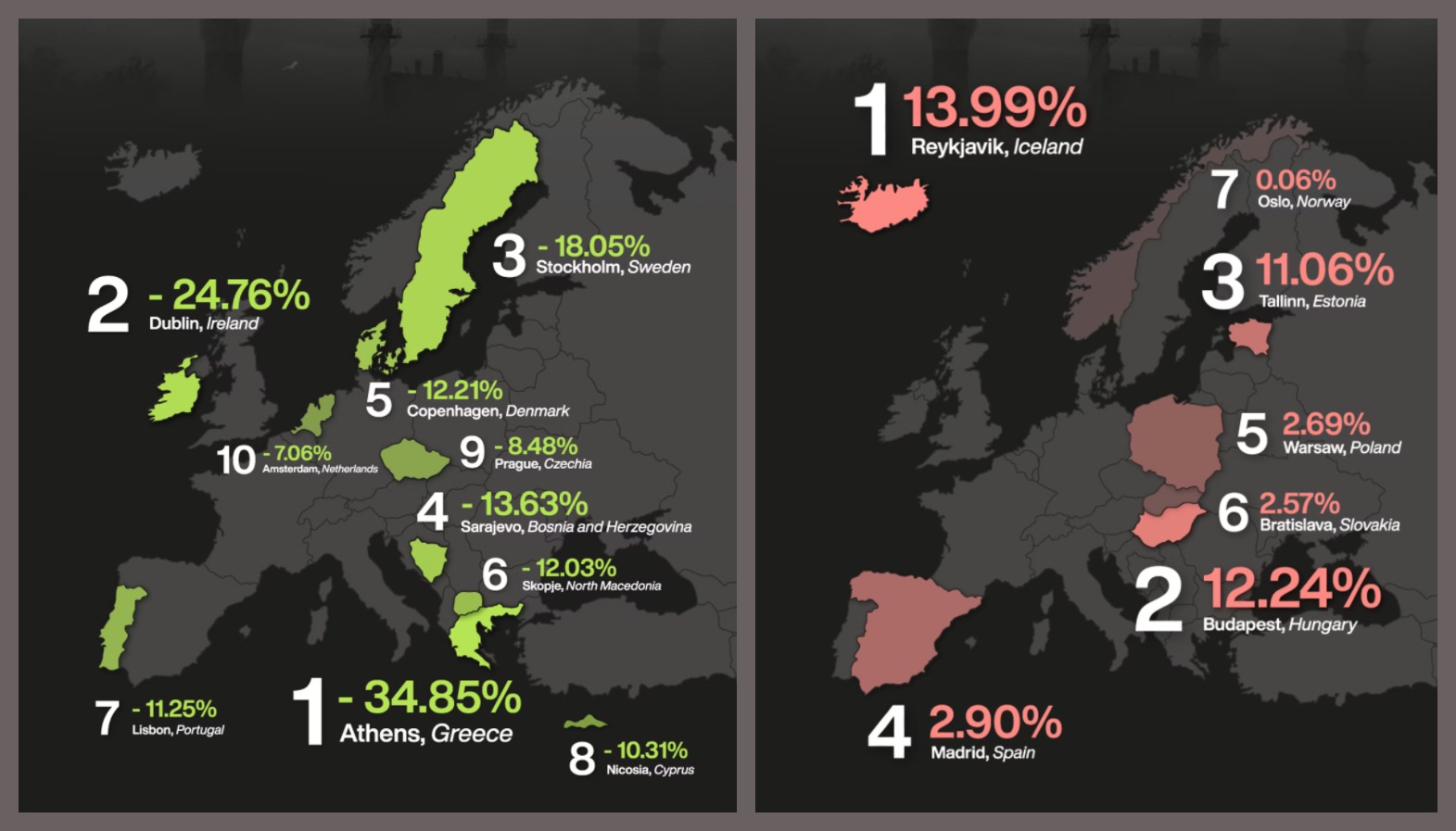
But don’t get fooled by these relative changes. In absolute terms, it’s still healthier to take a deep breath in Reykjavik than in Athens: In 2019, Athens had the second-worst average AQI in Europe, while Reykjavik had the best.
That absolute term is short for Air Quality Index, which is the EPA’s standard for reporting air quality. It’s also used on a global scale. The AQI is based on measurement of a number of harmful air pollutants, in particular: two types of particulate matter (PM2.5 and PM10, named after their maximum diameter in micrometer), as well as ozone (O3), nitrogen dioxide (NO2), sulphur dioxide (SO2), and carbon monoxide (CO).
Those measurements are translated into a figure on a scale from 0 to 500. That figure goes into one of six color-coded categories — the higher, the worse:
- Green (0-50): good
- Yellow (51-100): moderate
- Orange (101-150): unhealthy for sensitive groups
- Red (151-200): unhealthy for everyone
- Purple (201-300): very unhealthy
- Maroon (301 and up): hazardous
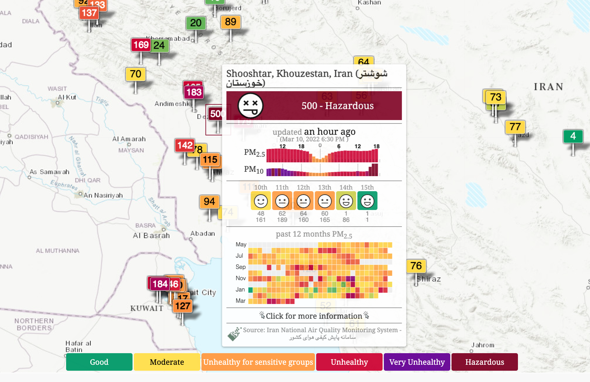
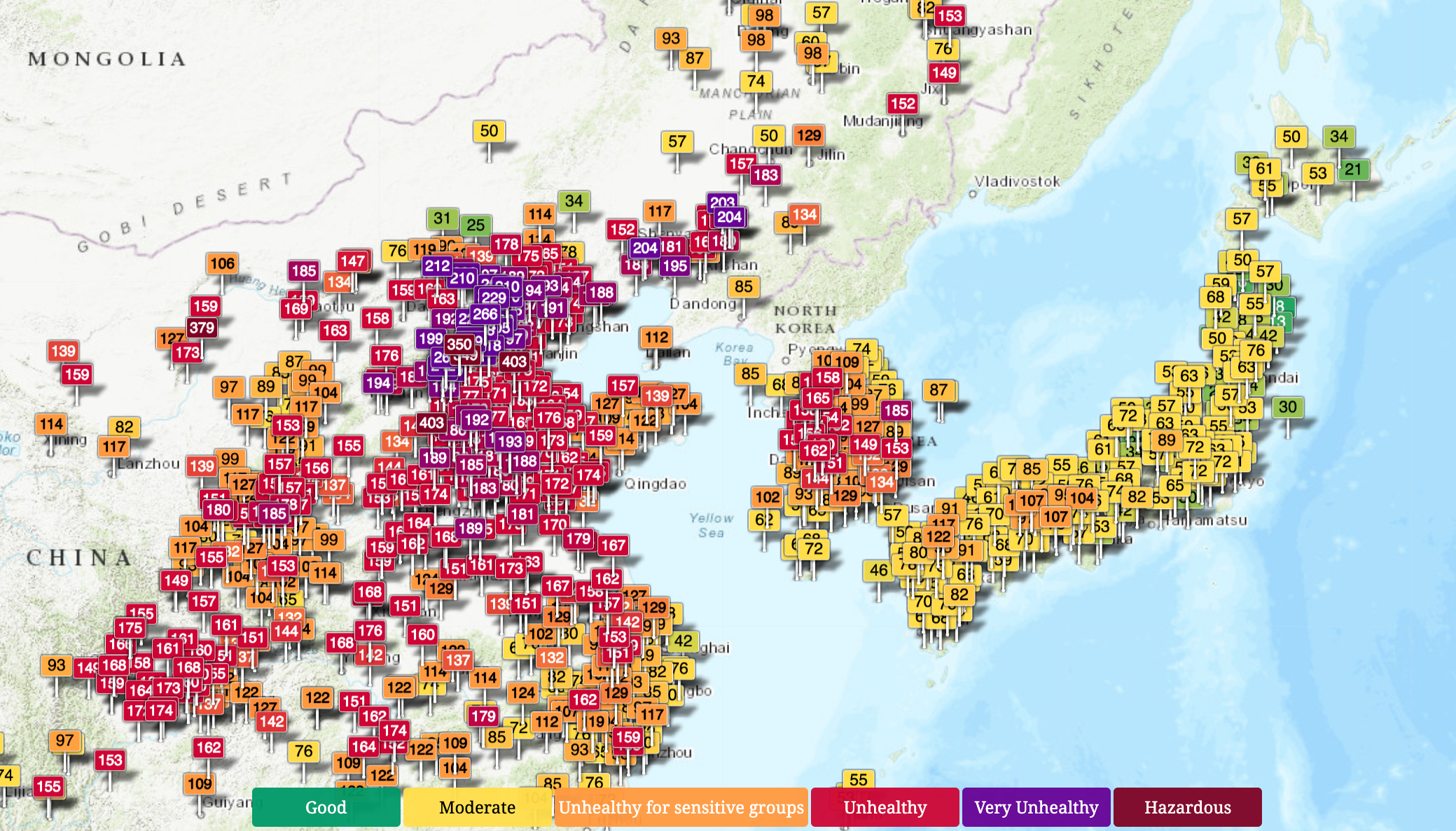
So, how is the air where you are? The World Air Quality Index will show you real-time AQI data from hundreds of sample stations around the globe. Each location is represented by an AQI number and color code. That makes it easy to identify some huge troublespots, like the densely populated and highly urbanized parts of Asia (i.e. large parts of China and India), but also Iran and other parts of the Middle East.
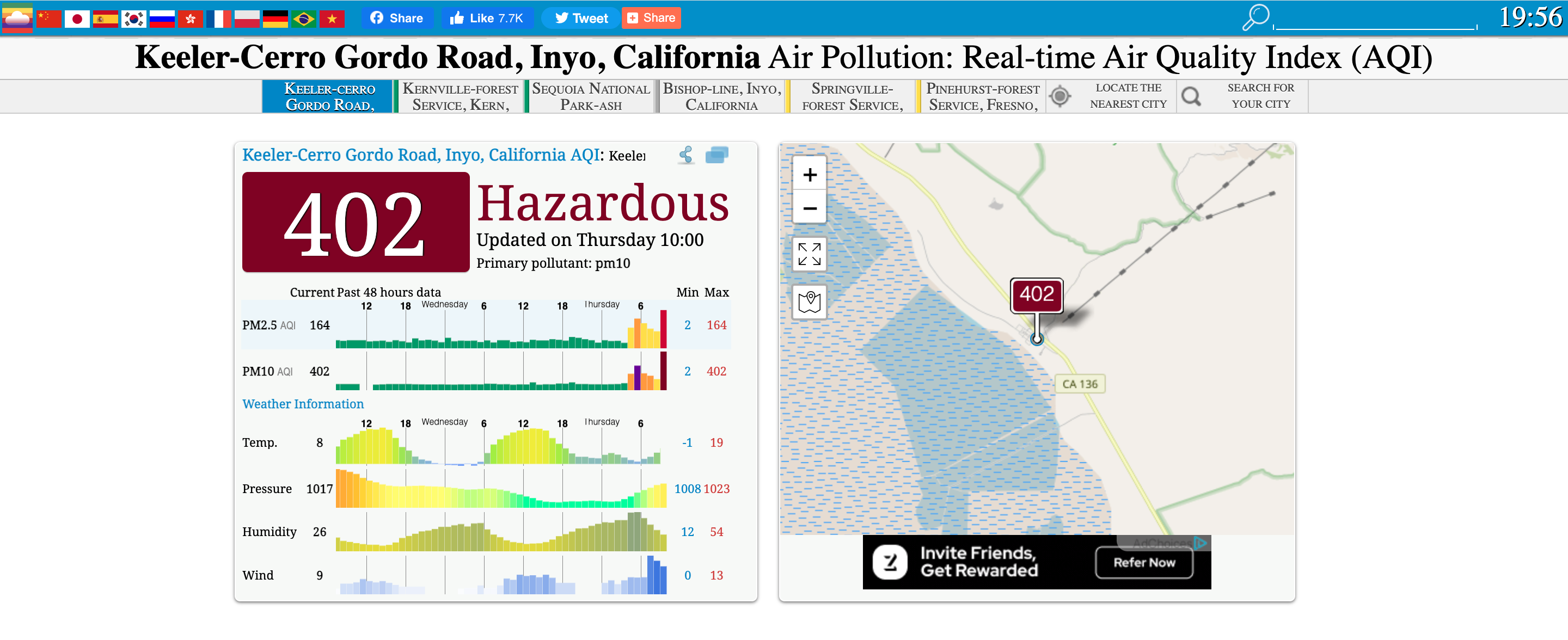
Quite a few places show an AQI in excess of 500. How is that possible if that’s where the scale ends? The scary truth: 500 is considered the unhealthiest score, but it’s not the highest one.
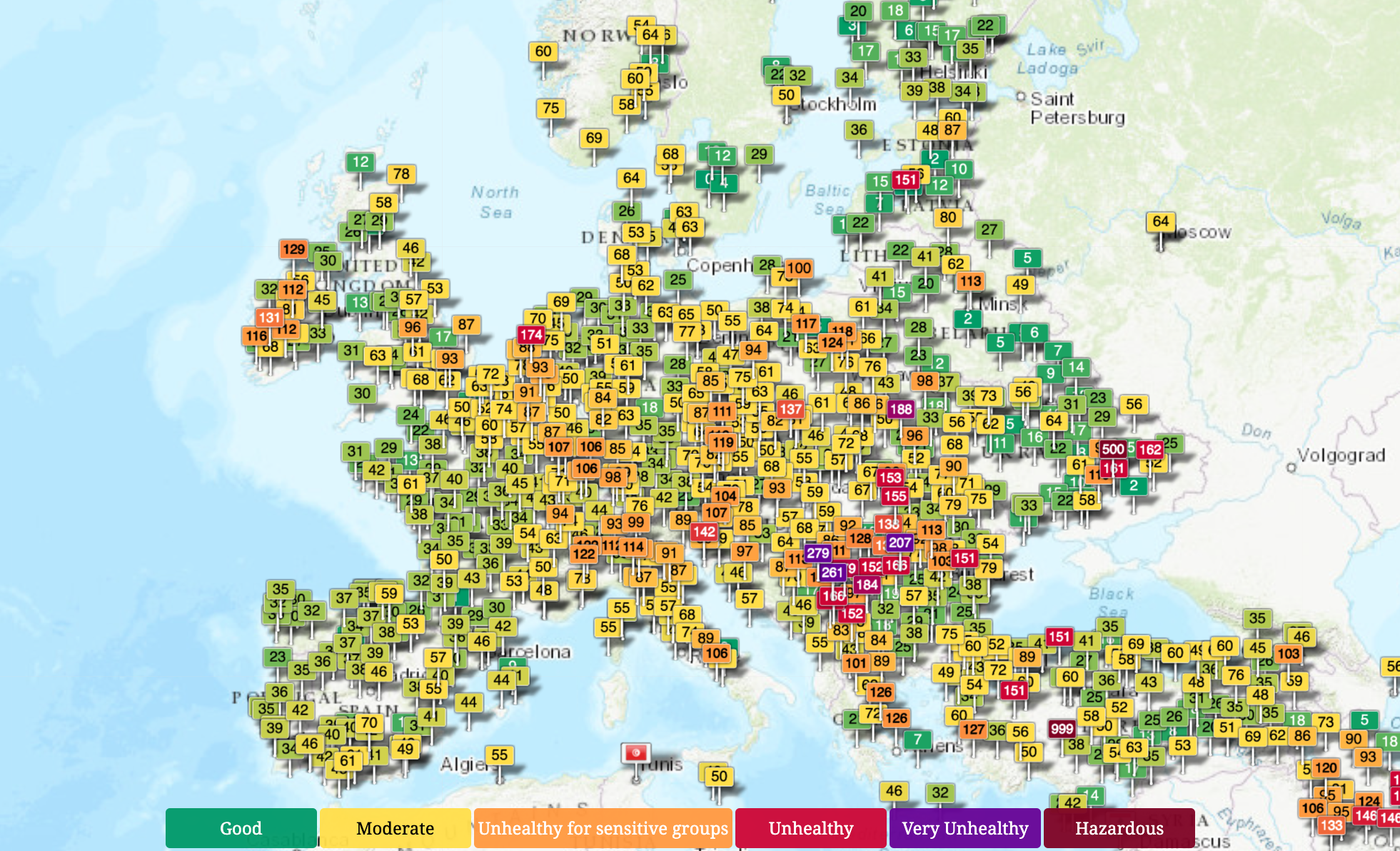
For example, an AQI of 401 to 500 represents PM2.5 concentrations over 250 micrograms per cubic meter, and PM10 concentrations of over 430 micrograms. However, those concentrations can go significantly higher. In some localities, including New Delhi in India, the highest reported AQI is 500. Elsewhere, the figure goes up to 999, which is the outer limit of the measuring values.
There is more yellow and green in Europe and North America, but also plenty of orange, red, and purple, especially in the more densely populated areas.
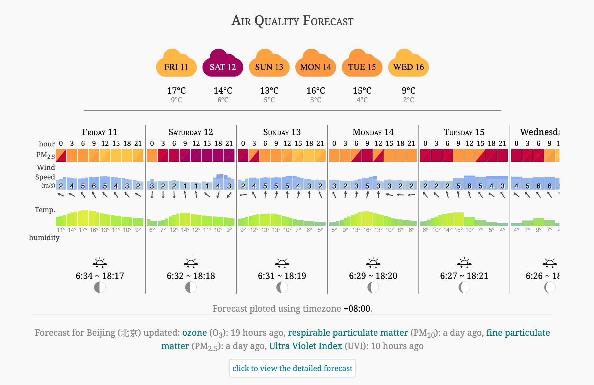
Much like a weather forecast, the World Air Quality Index map also provides an air quality forecast for most locations. For example, the one below is for Beijing. The forecast is not too bad, unless your airways are already compromised. And if they’re not: Don’t leave home without a mask on Saturday…
Strange Maps #1138
Got a strange map? Let me know at strangemaps@gmail.com