
We expect maps to behave and look a certain way. But tweak them a bit, and they can shock, amuse, or reveal some deeper truth. And with some luck and/or talent on the part of the mapmaker, perhaps all three in one.
Regional lampoon
That certainly applies to a strand of satirical cartography we could call “exaggerated regional chauvinism” — a school in which maps skew perspectives or enlarge certain areas, to lampoon the supposed self-importance of the localities involved, as well as that of their inhabitants.
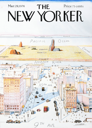
Those somewhat familiar with this cartographic theme already (rightly) anticipate a mention of Saul Steinberg’s “View of the World from 9th Avenue,” the New Yorker cover that launched a thousand parodies. At least as interesting as that image and its spin-offs are its antecedents, which reveal a small but interesting strand of American map humor that traces all the way back to 1908.
“30 years older”
“Perception-based cartography is at least 30 years older than I thought it was,” tweeted Tim Wallace, Senior Editor for Geography at the New York Times, back in 2016. That’s when he came across a 1908 cartoon from the Chicago Tribune, showing a septet of old white men, all balding, most chomping cigars and one pointing to a map of the United States.
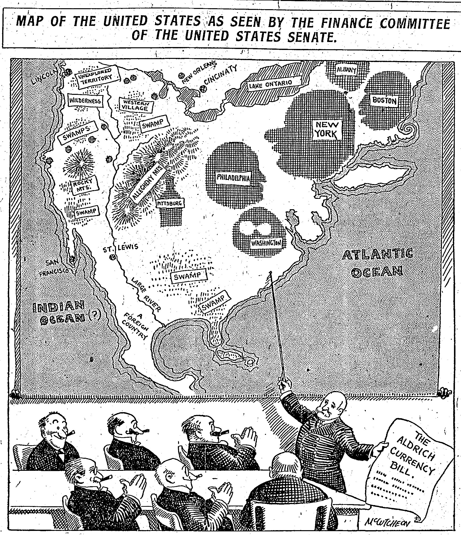
In his other hand, the pointer holds a piece of paper that reads “The Aldrich Currency Bill.” Passed by Congress in May 1908 and now referred to as the Aldrich-Vreeland Act, it was a reaction to the Knickerbocker Crisis of the year before. Those three critical weeks in October are also known as the Bankers’ Panic, when the New York Stock Exchange fell by almost 50%. The crash led to bank runs, constricted market liquidity, and eventually caused a nationwide wave of banks and businesses going bust.
Mocking government attitudes
To prevent similar crises, Aldrich-Vreeland gave banks the permission to issue emergency currency. A more permanent solution would be the establishment, a few years later, of the Federal Reserve Bank.
But we’re over-explaining the cartoon. Titled “Map of the United States as seen by the Finance Committee of the United States Senate,” it mocks the attitude in government circles of focusing on the big eastern cities and neglecting the rest of the country. The pointer points toward Washington, Philadelphia, New York, Boston, and Albany, which all loom large on the map. Pittsburg (then for a few more years without its final “h”) is shaped like a bottle, no doubt in reference to its brewing prowess. Pointedly absent is Chicago, home of the Tribune.
The rest of the country is a mess of swamps, mountains, wilderness, and territories either unexplored or too obscure to stick in the mind: the Mississippi is a “large river,” Mexico simply “a foreign country.” St. Louis is misspelled “St. Lewis,” and Cincinnati becomes “Cincinaty.” Placed nearby (that is, totally misplaced) is New Orleans. It may be that “western village” is the passive-aggressive self-designation of the Chicagoans, showing their frustration at the lack of attention from Congress.
Whose faces are these?
Intriguingly, Philadelphia, New York, and Boston (and perhaps also DC) are shaped like silhouettes of faces that may have been familiar to newspaper readers of the time. The cartoon is by John McCutcheon (1870-1949), the Pulitzer Prize-winning cartoonist for the Chicago Tribune, which printed his cartoons on the front page for 40 years. Even in life, he was known as the “dean of American cartoonists.”
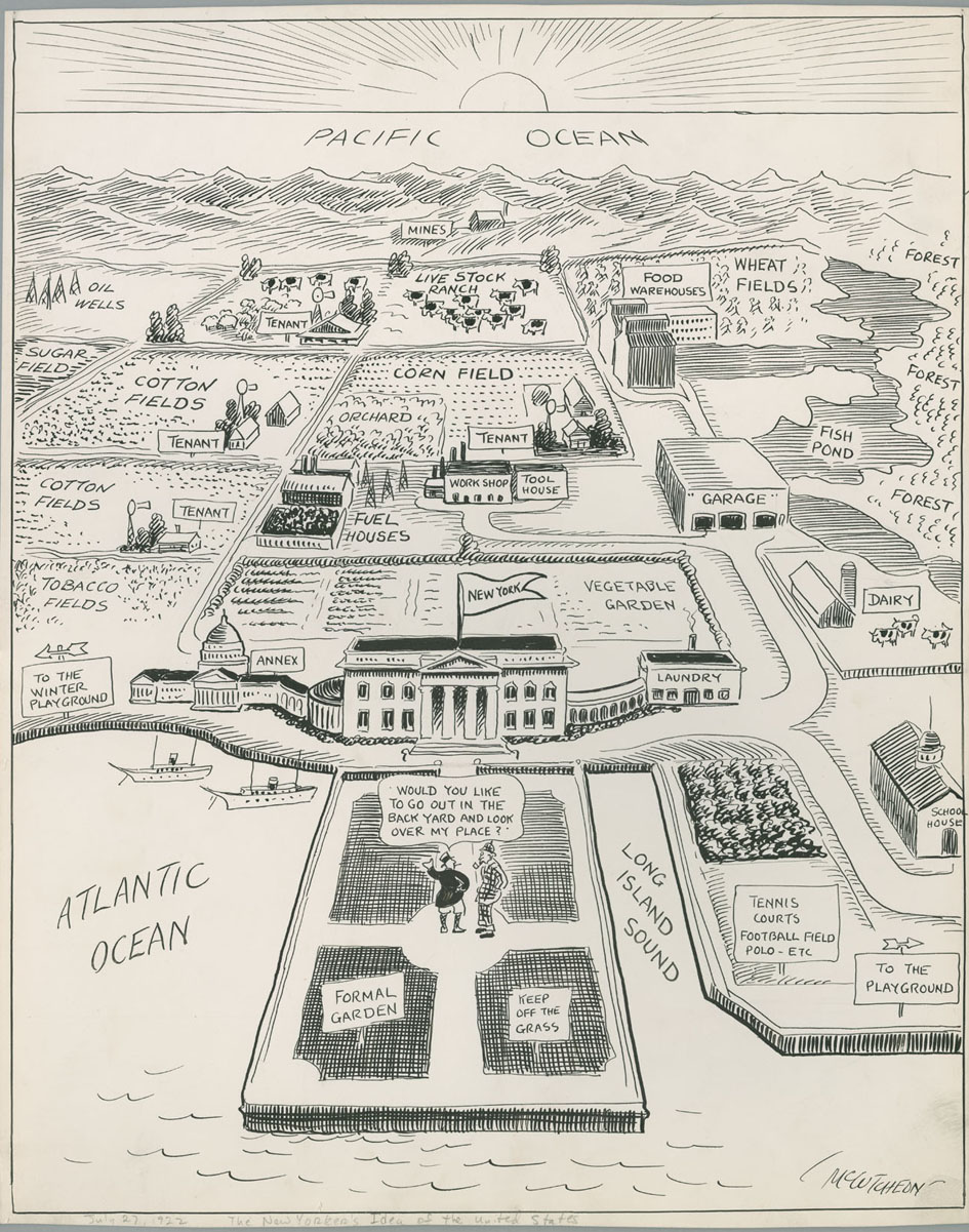
McCutcheon was the author of another perspective map, which retroactively seems a logical stepping stone toward Steinberg. Yet despite McCutcheon’s reputation among fellow cartoonists and with the public at large, this one also appears to have been apocryphal rather than influential.
Published in 1922, the cartoon is called “The New Yorker’s Map of the United States.” We are hovering over the Atlantic and looking over New York all the way to the Pacific. “Would you like to go out in the backyard and look over my place?” asks the host of a visitor dressed in tweed and deerstalker (i.e., a British guest).
Washington, New York’s annex
New York is a building with a classic Greek front (possibly symbolizing the Stock Exchange), which has “Washington” as an annex. As far as the eye can see stretch fields of sugar, cotton, and tobacco, orchards and vegetable gardens, corn and wheat fields, fish ponds (the Great Lakes) and livestock ranches (the West), mines (California) and oil wells (Texas), and workshops and tool houses. A garage represents Detroit. Any locals are merely “tenants.”
The message is clear: America and its riches are run from and for the benefit of New York. Or at least so the New Yorker of circa 1922 was happy to believe. Steinberg didn’t see that cartoon, at least not the first time around. Back in 1922, he was an eight-year-old kid in Romania. He arrived in the States only in 1941, on the run from Europe’s anti-Semitism.
A much more likely course for this satirical map meme is that McCutcheon’s New York cartoon inspired Daniel K. Wallingford — and it is his map that is most often cited as an inspiration for Steinberg.
Christmas present turns into a hit
Wallingford, an industrial engineer by trade, also dabbled in mapmaking. In 1932, he had 100 copies printed of his “A New Yorker’s Idea of the United States of America” to distribute among his friends as Christmas presents. It proved such a hit that he had to issue a second print run, which he began to distribute via mail order.
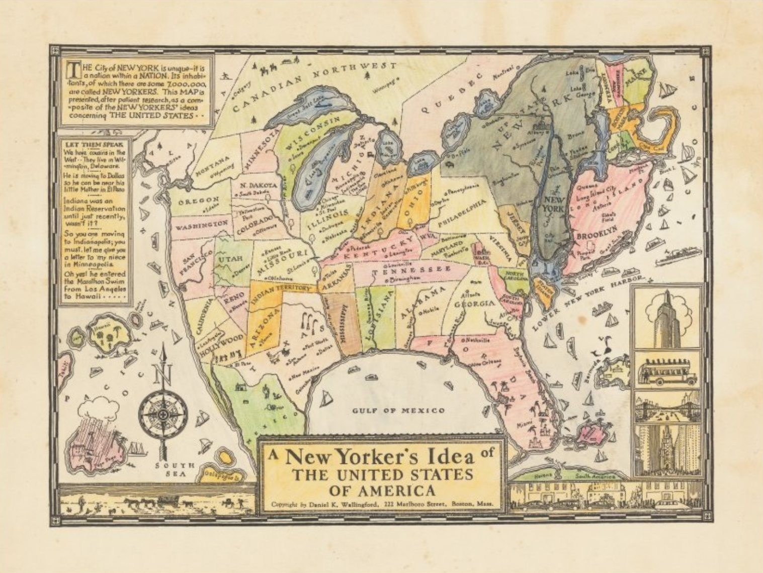
His map, originally black and white but often colorized, shows a fairly traditional map of the United States except that the area around New York is on steroids. Manhattan and Brooklyn, both hypertrophied, on their own are bigger than most states, which are randomly scattered across the remainder of the nation and occasionally mislabelled or forgotten, as to indicate their unimportance.
New York is “a nation within a nation,” the map’s legend explains, and cites some typical New York attitudes toward the rest of the country:
- “We have cousins in the West… they live in Wilmington, Delaware.”
- “He is moving to Dallas so he can be near his little Mother in El Paso.”
- “Indiana was an Indian Reservation until just recently, wasn’t it?”
- “So you are moving to Indianapolis, you must let me give you a letter to my niece in Minneapolis.”
- “Oh yes! He entered the Marathon Swim from Los Angeles to Hawaii.”
The success of his New York map, combined with the already slightly engorged state of Cape Cod on that first map, and the fact that he moved to Boston gave rise to Wallingford’s second map: “A Bostonian’s Idea of the United States of America.”
Who is a Bostonian?
This one is certainly wordier than his first endeavor, both on the map and in the legend. First, he attempts a definition of what, in 1936, constituted a Bostonian: not necessarily someone born and residing in Boston, but rather someone born in Hingham and residing in Newton — apparently because such a person was much more likely to spend time in England and “the Continent” (Europe).
Just off Plymouth, the map reads: “American history began here. Est. 1620.” Massachusetts and the other New England states are shown in larger-than-life size. New York, on the other hand, is hard to spot.
Beyond the Catskills, there are only the Western Prairies. (“Dayton, Kansas City, Toledo, Helena, Tulsa, Indianapolis, Milwaukee, and other such cities are located in this territory.”) Further south, on the Mississippi and its tributaries, are St. Louis, Pittsburgh, and Cincinnati, all spelled correctly this time. Across the Rocky Mountains is California, which erroneously contains Omaha, Denver, and Reno.
Disinterest and disdain
Like its New York counterpart, this Boston map exudes disinterest and disdain for the vast wasteland that is most of the United States. Even the Great Lakes warrant nothing bigger than puddle size. Yet all in all, the fun being poked is fairly mild. A separate label glories in the many fine universities in Boston and environs, although it admits that “there are also several excellent schools located in the WEST.”
Wallingford’s maps gave others the idea to oversize particular parts of the country for humorous effect. A nice example is this “United States Map as the Floridian* Sees It,” which was published in 1948 by the Florida Novelty Map and Stamp Company in St. Petersburg, Florida. The map was drawn by Jack Swenningsen, a Danish native and St. Petersburg resident.
In the fine print, the asterisk is explained. A Floridian is “any northerner whose system has absorbed one part suntan lotion, two parts essence of Mexican jumping beans, and six parts salt water. A NUDIST IN A BATHING SUIT!”
The striking thing about this map is not just the elephantiasis of the Floridian peninsula, but also its rivalry with California. It appears both are vying for émigré New Yorkers — but why would any even consider going all the way out West?
“18,000 ridiculous and hazardous miles”
As the map points out, it’s “about 18,000 ridiculous and hazardous miles” from the “Big Town” (New York) and “Dodger Land” (Brooklyn) to California. (Ironically, the Dodgers managed the move to Los Angeles just fine, a mere 10 years later.)
On this map, California is beset by ice and snow, floods and washouts, icebergs and sandstorms. The “Califoolya Weather Bureau” operates out of an igloo. In contrast, Florida is just “100 nice and easy miles” south of “the Nawth.” All roads lead to Florida — one way.
And why would they go any other way? Florida’s bounties are many. It has the “world’s finest & biggest oranges,” movie stars, fish, and the “world’s oldest city.” (Actually, St. Augustine is merely the oldest city in the U.S.) Florida also has fiestas, the original five-cent cigar, the “world’s finest harbor” at Pepsacola (sic; also home to the world’s only permanent wave), and “goils” on sun-kissed beaches.
And for good measure, at least according to this map, Florida also has Niagara Falls, Hollywood, and Yankee Stadium.
Another typical example of a chauvinist map of the “hypertrophy” persuasion is this classic postcard, showing “A Texan’s Map of the United States,” with the Lone Star State so big that it divides the rest of the country in two. The diminutive states have funny, misremembered names: “Arid Zone,” “Ill Noise,” “Canned Turkey,” etc.
Two map strands
Clearly, we can now distinguish two different strands of “exaggerated regional chauvinism” maps. And it is more than likely, and in fact rather obvious, that Steinberg’s famous 1976 cartoon showing what the world looks like from New York’s 9th Avenue is not a descendant of Wallingford’s hypertrophied map from 1932 but of McCutcheon’s forced perspective map from 10 years prior.
So, whenever the Steinberg map gets rolled out, parodied or homaged — as in this “Steinberg map” version of Jerusalem — let’s give credit where it is due by honoring its actual ancestor, the 1922 McCutcheon map.
Check out more of Saul Steinberg’s fantastic/cartographic work here at the Saul Steinberg Foundation.
Strange Maps #1145
Got a strange map? Let me know at strangemaps@gmail.com.