
This map is already outdated. It shows the U.S. sourcing 13.1% of its electricity from wind and solar in 2021. This April, and for the first month ever, the country generated 20% of its power from those two renewable sources.
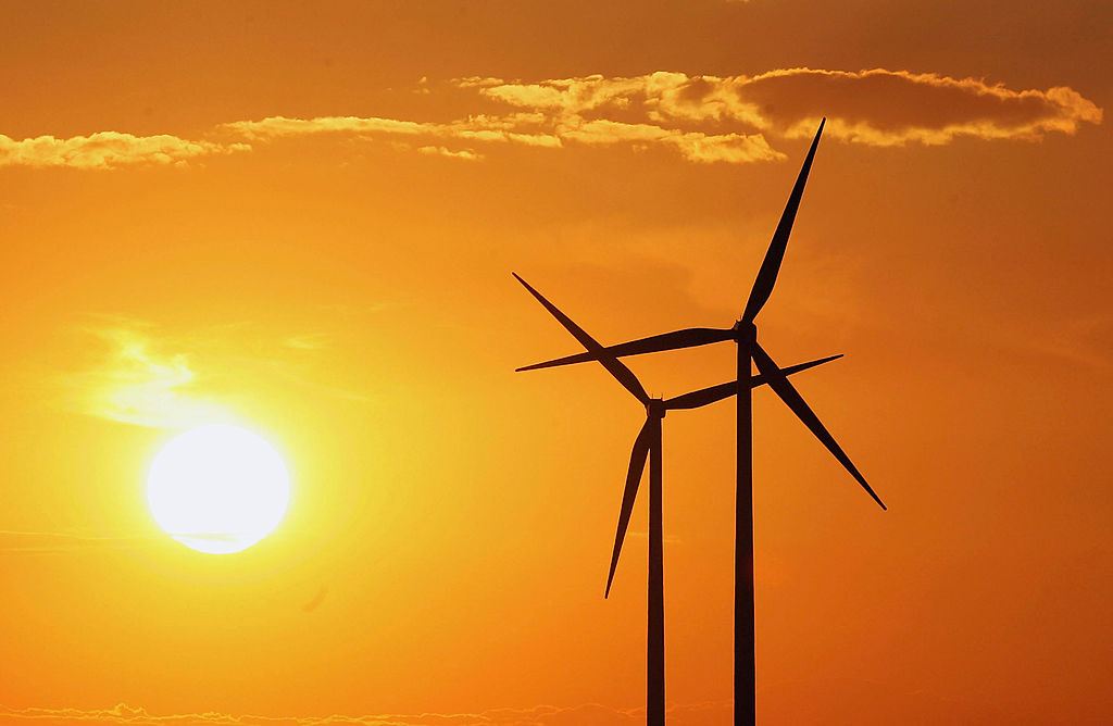
A blurry snapshot of a rapid object
That’s indicative of the speed at which wind and solar are ramping up, not just in the U.S., but across the world. In that sense, this blurry snapshot of a rapidly moving object retains its value, visualizing just how far we had already progressed since last year.
In the past decade, America has experienced a remarkable surge in renewable energy generation. In 2015, the year the Paris Climate Agreement was signed, the country generated just 5.7% of its electricity from wind and solar. Last year, it was 13%. In March 2022, 18%. And last month, 20%. Driving that surge is a “wind boom” in the Great Plains and Midwestern states, with windmills going up in great numbers from Texas to the Dakotas.
Globally, wind and solar have been the fastest-growing forms of electricity generation every year since 2005. The share of global power produced by these renewables has more than doubled between 2015 and 2021, which was the first year they delivered 10% of electricity worldwide — 10.3%, to be exact, up from 9.3% the previous year. Taken together, they are now the fourth largest global source of electricity, after coal, gas, and hydro.
Wind and solar at 70% by 2050
That rapid escalation provides some hope that, for once, an international climate target might be met.
In 2020, electricity generation emitted more greenhouse gases than any other industry. According to the International Energy Agency, wind and solar must hit 20% of global energy by 2025 (and 70% by 2050) if we want to reach overall net-zero carbon by the 2050 target set by the Paris Agreement.
Adding to the environmental imperative, the war in Ukraine has exposed Europe’s dependence on Russian oil and gas as a geopolitical liability of the first order. At least part of the remedy: more renewables, faster.
As it is, and as the map shows, European countries are in the global vanguard when it comes to wind and solar power. This will cushion them from the worst effects of turning off the Russian hydrocarbon tap, as now seems inevitable. Just a few days ago, the EU agreed to block 90% of all Russian oil imports by the end of this year.
Welcome to sunny, windy Luxembourg
Nine of the ten countries with the highest share of wind and solar power in their national energy mix last year were European. Denmark was the global leader, and the only country in the world getting more than half (51.9%) of its power from these renewables.
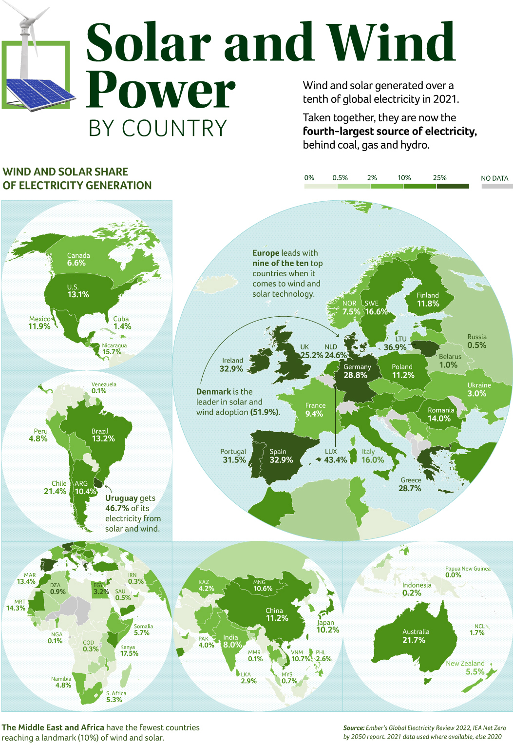
A fair number of European countries get more than a quarter of their power from wind and solar, including a few large ones. In descending order: Luxembourg (43.4%), Lithuania (36.9%), Spain and Ireland (both 32.9%), Portugal (31.5%), Germany (28.8%), Greece (28.7%), and the UK (25.2%). The Netherlands, traditionally seen as the country of windmills, falls just outside this category, with 24.6%.
Of Europe’s Big Five economies (that is, Germany, France, UK, Italy, and Spain), only France scores below 10%. Due to a long-standing policy based on energy security, France derives about 70% of its electricity from nuclear energy. Not all European countries are represented on the map, but among those who are, the worst performers are Russia (0.5%), Belarus (1%), and Ukraine (3%).
Uruguay, American outlier
Second place worldwide, Uruguay (46.7%), is an outlier in the Americas. Other notable countries are Chile (21.4%), Nicaragua (15.7%), and Brazil (13.2%). Mexico (11.9%) is doing better than the global average, and otherwise progressive Canada is doing rather worse (6.6%).
It’s almost impossible to do worse than Venezuela, though: With energy from wind and solar at an almost imperceptible 0.1%, the oil-rich country doesn’t seem to have made any effort at decarbonizing its energy sector.
Africa has plenty of sun, and a few countries have taken great strides at profiting from it. The continent’s renewables leaders are Kenya (17.5%), Mauritania (14.3%), and Morocco (13.4%). South Africa, often hailed as Africa’s most advanced economy, is stuck at 5.3%.
Still, it’s better than Nigeria’s measly 0.1%, yet another country fallen victim to its easy access to domestic oil. This is also the case in the Middle East, with Saudi Arabia (0.5%) and Iran (0.3%) remaining well below one percent wind and solar. Even Somalia, which has plenty of domestic problems of its own, manages 5.7%.
Can’t do worse than PNG
In East Asia, China (11.2%) is the wind and solar superpower. Two other countries also manage to outperform the global average, if only by a little: Vietnam (10.7%), Mongolia (10.6%). Japan (10.2%) falls just short. India is at 8%. Of course, these national figures should be considered in relation to the absolute size of the national energy markets. India consumes around 1.4 million gigawatt-hours of electricity per year, Mongolia around 7,000.
The worst students in the class in this part of the world include Myanmar/Burma (0.1%) and Malaysia (0.7%).
In its region, Australia (21.7%) stands tall, vastly outperforming New Zealand (5.5%). New Caledonia is at 1.7%, which is still a lot better than Indonesia’s 0.2% — which is still a lot better than Papua New Guinea’s 0.0%.
There are still plenty of places around the world that need to crack the so-called “trilemma” of energy transition — namely, creating a supply of electricity that is not just sustainable but also affordable and secure. It’s time for the Danes and Uruguayans to show the rest of us how that’s done.
Map found here on Visual Capitalist.
Strange Maps #1152
Got a strange map? Let me know at strangemaps@gmail.com.