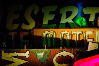
Who isn’t fond of fonts? Even if we don’t know their names, we associate specific letter types with certain brands, feelings, and levels of trust.
Typography equals psychology. For example, you don’t want to get a message from your doctor, or anybody else in authority, that’s set in comic sans — basically, the typeface that wears clown makeup.
A new serif in town
If you want to convey reliability, tradition, and formality, you should go for a serif, a font with decorative bits stuck to its extremities. Well-known examples include Garamond, Baskerville, and Times New Roman. Remove the decoration, and you’ve got a clean look that communicates clarity, modernity, and innovation. Arial and Helvetica are some of the most popular sans serif fonts.
There’s a lot more to font psychology, but let’s veer toward another, less explored Venn diagram instead: the overlap between typography and geography. That’s where Andy Murdock spent much of his pandemic.
Mr. Murdock is the co-founder of The Statesider, a newsletter about (among other things) travel and landscape in the United States. He remembers his first encounter with a home computer back in 1984 and learning from that Macintosh both the word “font” and the name for the one it used: Chicago.

You can see where this is going. Mr Murdock retained a healthy interest in fonts named after places. Over the years, he noted Monaco, London, San Francisco, and Cairo, among many others. “And then, the question of how many fonts are named for U.S. places came up in an editorial meeting at The Statesider,” Mr Murdock says.
It’s the sort of topic that in other times might never have gone anywhere, but this was the start of the pandemic. “I was stuck for days on end, so I actually started looking into it. At some point, I realized that I could probably find at least one per state.” Cue the idea for a map of the “United Fonts of America.”
Challenge turns into obsession
But that was easier said than done. Finding location-based fonts turned out to be rather time-consuming. “I definitely didn’t realize what I was getting myself into,” Mr Murdock recalls. “I could quickly name a few — New York, Georgia, Chicago — but I had no idea that I’d be able to find so many.”
What started as a quirky challenge turned into an obsession and a compulsion that would have the accidental font-mapper wake up in the middle of the night and think: Did I check to see if there’s a Boise font? (He did; there isn’t.)
“The hardest part was knowing when to stop,” said Mr Murdock. “Believe me, I know I missed some.” In all, he found 222 fonts referencing places in the United States and its territories.

For the most part, these fonts are distributed as the population is: heavy on the coasts and near the Great Lakes, but thin in most parts in between. California (23 fonts) takes the cake, followed by Texas (15), and New York (9).
Some of the fonts have interesting back stories, and in his article for “The Statesider”, Mr Murdock provides a few:
- Georgia was named after a newspaper headline reading “Alien Heads Found in Georgia.”
- Fayette is based on the handwriting of the record-keeper of a place called Fayette, now a ghost town in Michigan’s Upper Peninsula.
- Tahoma and Tacoma are both pre-European names for Mount Rainier in Washington state.
Mostly, the fonts repeat the names of states and cities, but some offer something more interesting, such as the alliterating Cascadia Code or the lyrical Tallahassee Chassis. Other less than ordinary names include Kentuckyfried and Wyoming Spaghetti.
Capturing the spirit of a place
As an unexpected expert in the geographic distribution of location-based fonts, can Mr. Murdock offer any opinion on the qualitative relation between place and typeface?
“Good design of any sort can capture the spirit of a place, or at least one perspective on a place,” he says, “but frankly, that only occasionally seems to have been the goal when it comes to typefaces.”
In his opinion, the worst fonts reflect a stereotype about a place, rather than the place itself: “Saipan and Hanalei are both made to look like crude bamboo. Those are particularly awful. Pecos feels like it belongs on a bad Tex-Mex restaurant’s menu.”

“Santa Barbara Streets, on the other hand, is quite nice because it captures the font that’s actually used on street signs in Santa Barbara. I prefer the typefaces that have a story and a connection to a place, but it’s a fine line between being artfully historic and being cartoonishly retro.”
Let’s finish off Route 66
Glancing over the map, some regions seem more prone to “stereotypefacing” than others: “Tucson, Tombstone, El Paso — you know you’re in the Southwest. Art Deco fonts are mostly in the east or around the Great Lakes. In general, you find more sans serif fonts in the western U.S., and more serif fonts in the east, but that’s not a hard-and-fast rule.”
Noticing a few blank spots on the map, Mr. Murdock helpfully suggests some areas that could do with a few more fonts, including the Carolinas, the Dakotas, Maine, Missouri, West Virginia, New Jersey, and Rhode Island.
Oh, and Route 66. Nearly all of the cities mentioned in the eponymous song have a typeface named after them. “We need Gallup and Barstow to complete the set.”
And finally, America’s oft-overlooked overseas territories could be a rich seam for type developers: “Some of these names are perfect for a great typeface — Viejo San Juan, St. Croix, Pago Pago, Ypao Beach, Tinian.”
To name but a few. Typeface designers, sharpen your pencils!
Map found here at The Statesider, reproduced with kind permission. For more dispatches from the weird interzone between geography and typography, check out Strange Maps #318: The semicolonial state of San Serriffe.
Strange Maps #1090
Got a strange map? Let me know at strangemaps@gmail.com.
