
Dear billionaires, are you afraid of water? While Jeff, Elon, and Richard are throwing mountains of cash at a private-sector replay of the space race, more than half of the planet they take off from remains unmapped. To be precise: 80 percent of the ocean floor. Considering oceans cover 70 percent of Earth, that works out to 56 percent of its total surface.
The Japanese, champion ocean mappers
This map puts what is missing into perspective. The light areas are already mapped. For the dark patches, we often only have the slightest understanding of the local depth and shape of the ocean floor.
The distribution of light and dark tells us something about the progress of submarine mapping. Light-blue lines crossing the dark-blue expanse are busy, well-charted shipping lanes. Larger light-blue patches correspond to the waters of countries where mapping their bit of ocean is a priority.
- As the map (and the graph) shows, Japan leads the world: only 2.3 percent of its Exclusive Economic Zone remains unmapped.
- Next, at some distance, are the UK (9.4 percent of its EEZ unmapped), Norway (18.1 percent), and New Zealand (26 percent).
- The U.S. is not doing too poorly, with just 30.1 percent of its EEZ left to chart. Yet Hawaii, mentioned separately here, has almost half (47.5 percent) of its EEZ left to explore.
- China has no maps of almost nine-tenths (88.6 percent) of its ocean floor. But that’s still better than the stragglers on the list: Madagascar (94.5 percent), Bangladesh (96.7 percent), and Thailand (98.5 percent).
Up from 6 percent in 2017
As of the middle of this year, the share of the world’s total ocean floor that has been mapped in detail stands at 20.6 percent. That may not sound like a lot, but it’s already a great improvement over 2017, when Seabed 2030 was launched. Back then, just 6 percent of the world’s oceans had been mapped by modern means.

The project’s goal to achieve 100 percent public access coverage by 2030 is ambitious, but they have help. Seabed 2030 is urging the many governments, companies, and institutions who privately have data on non-covered areas to release it.
It is also crowdsourcing by asking just about any vessel that is willing and able to produce depth data to contribute to the effort – even if it’s just an ordinary fishing vessel or a tiny yacht.
Why do we need ocean floor maps?
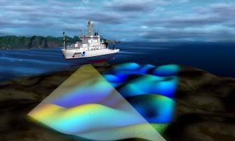
Why do we actually need better maps of the ocean floor? One answer is curiosity. Another is science. Another is navigation. As a relevant example, take the tragic accident of the USS San Francisco in 2005.
Cruising at a depth of no more than 525 feet (160 m) somewhere south of Guam, this U.S. Navy nuclear attack submarine collided head-on with an uncharted seamount. The violent collision injured more than two-thirds of the ship’s 137-member crew. One sailor later died from his injuries. The sub itself also sustained heavy damage.
Knowing the terrain underwater is essential for rolling out cables, pipelines, and other underwater infrastructure. It will make it easier to spot and protect marine biodiversity (with seamounts often serving as hotspots). The shape of the ocean floor also influences currents, and thus also weather patterns and climate change. And insights into submarine geography may even be instrumental in predicting the course of future tsunamis.
The return of Boaty McBoatface
Seabed 2030 is a project funded by the Nippon Foundation and GEBCO, the General Bathymetric Chart of the Oceans. The project’s aim is to bring together all available bathymetric data to produce a definitive, all-encompassing, and open-access map of the world’s ocean floor by 2030.

It seems the project is already creating its own weather, so to speak. British research vessels plying the waters of the Drake Passage have modified their usual routes in order to map more of the area, with noticeable results.
One of the British ships contributing to the global mapping effort is the RRS Sir David Attenborough, specially equipped with a deep-water multibeam echo-sounding system. The research vessel is perhaps better known for its initial name, chosen by the British public in a poll the result of which was sadly rejected by the authorities: Boaty McBoatface.
Increasingly, so-called USVs (uncrewed surface vessels) — essentially, underwater drones — are deployed to map ever larger parts of the ocean. And yes, the mysteries of the deep have also captured the imagination of at least one billionaire. As explained by the BBC’s Jonathan Amos, Texan billionaire Victor Vescovo has led expeditions to the deepest parts of the world’s oceans. With his vessel DSSV Pressure Drop, Vescovo recently mapped an area the size of France in a mere ten months.
Thanks to his efforts and those of many others, future versions of this map will turn increasingly light blue. Around the year 2030, there will finally be nothing new left to map on this planet.
Map produced by Andrew Douglas-Clifford, a.k.a. The Map Kiwi. Reproduced with kind permission.
The map shows the world in the Spilhaus projection. For more on that see Strange Maps #939, Finally, a world map that’s all about oceans.
Strange Maps #1095
Got a strange map? Let me know at strangemaps@gmail.com.
Follow Strange Maps on Twitter and Facebook.