Just on its own, a world map doesn’t say much about the world. If it is in the standard Mercator projection, it will even get the relative size of countries spectacularly wrong: it blows up Greenland to the size of Africa, but the island is 14 times smaller than the continent.
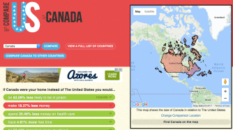
Here is a tool that solves the area comparison issue by sticking a size-appropriate projection of one country on another. But ifitweremyhome.com does a lot more. Taking your home country as its baseline, the website compares it to any other country of your choice, using statistics on sickness and health, poverty and wealth. You think you have it so bad/good? See how the other half lives!
Apart from the map, the site produces three kinds of stats: red ones if the other country compares unfavourably, green ones for favourable results, and blue for neutral. Here is an example. What if you were born in, say, the Democratic Republic of the Congo instead of the United States of America?
The DR Congo is one of the biggest countries in Africa. As its superimposition on the U.S. map shows, it stretches from New Mexico to Detroit, and from North Dakota to New Orleans.

But size isn’t everything. If you were Congolese instead of American, you’d be almost 12 times more likely to have died in infancy, and your life would be 23 years shorter. And in between that perilous birth and that untimely end, you’d make 99.24% less money. Oh, and you’d also be 83.33% more likely to have HIV/AIDS and would run 3.6 times the risk of being murdered.
That is a shocking list of ‘red’ facts. But there are also some ‘green’ ones: as a Congolese, you spend 99.83% less money on health care, consume 99.83% less oil and 99.34% less electricity, and are 94.99% less likely to be in prison. And in the ‘blue’ category, you will have 2.7 times more babies.
Given these odds, most people would choose America over the DR Congo. Including most Congolese. But don’t flatter yourself, America. There are plenty of places with better vital statistics than the U.S. And you don’t have to look far. Take Canada, for instance.

Okay, so Canadians make 18.4% less money, use 17.7% more electricity and consume 9.6% more oil. But that’s a pretty short list of ‘red’ stats, outweighed by a much longer list of ‘greens’:
Compared to Americans, Canadians are 23.7% less likely to die in infancy and live 2.1 years longer. They have 4.8% more free time and spend 35.5% less money on health care.They are also 83% less likely to be in prison, 63.2% less likely to be murdered, 50% less likely to have HIV/AIDS and 2.7% less likely to be unemployed. They experience 28.67% less of a class divide, and have have 23.32% fewer babies (although that last fact is of course neither red nor green).
Oh, so you think Canada is an exception? How about Australia?

Just one red fact: if you lived there, you would make 18.5% less money. But think about what that would pay for. A lot of green stuff:
You would be much less likely to die in infancy (28.2%) and have HIV/AIDS (83.3%), or be unemployed (21.9%), imprisoned (79.4%) or murdered (71%). You would have (6.7%) more free time and live (2.5 years) longer, in a (32.7%) less class-ridden society, spending less on health care (31%), oil (23%) and electricity (22.2%).
To see how other other half lives, you can select any other country as your baseline. Take for instance the aforementioned Greenland, an autonomous part of Denmark. And compare it to Denmark itself: Danes live more than 7 years longer than Greenlanders and are almost 80% less likely to be in prison, 36% less likely to be unemployed and more than 60% less likely to be murdered.

No wonder Greenlanders are flocking to Denmark instead of the other way around. In fact, if you consider this website as any other comparison tool, it explains a lot about current migration patterns – away from places like the DR Congo and Greenland, towards places like Denmark, Canada and the U.S.
Take for instance the stark contrast between Haiti and the Dominican Republic, two countries that share the Caribbean island of Hispaniola. If you want to know why the Haitians are migrating to the other side of the island instead of the Dominicans, it is because the average inhabitant of the Dominican Republic is 63% less likely to be unemployed, makes 7.5 times more money and lives 14.6 years longer.

Okay, so they spend more on electricity, oil and health care – but that could also mean there is more of all those things available than in Haiti. If you or I were Haitian, we too would be tempted to slip across the border, even if that means we would be more likely to end up murdered or in prison.
Fortunately, the site offers more than grim statistics. One of the easter eggs pops up if you try to skew the stats by selecting the Vatican as your home country. Select any other country to compare it with, and the message reads:

Many thanks to Orion Jones for pointing out this map.
Strange Maps #825
Got a strange map? Let me know at strangemaps@gmail.com.
