Strange Maps
A special series by Frank Jacobs.
Frank has been writing about strange maps since 2006, published a book on the subject in 2009 and joined Big Think in 2010. Readers send in new material daily, and he keeps bumping in to cartography that is delightfully obscure, amazingly beautiful, shockingly partisan, and more. "Each map tells a story, but the stories told by your standard atlas for school or reference are limited and literal: they show only the most practical side of the world, its geography and its political divisions. Strange Maps aims to collect and comment on maps that do everything but that - maps that show the world from a different angle."
featured
All Stories
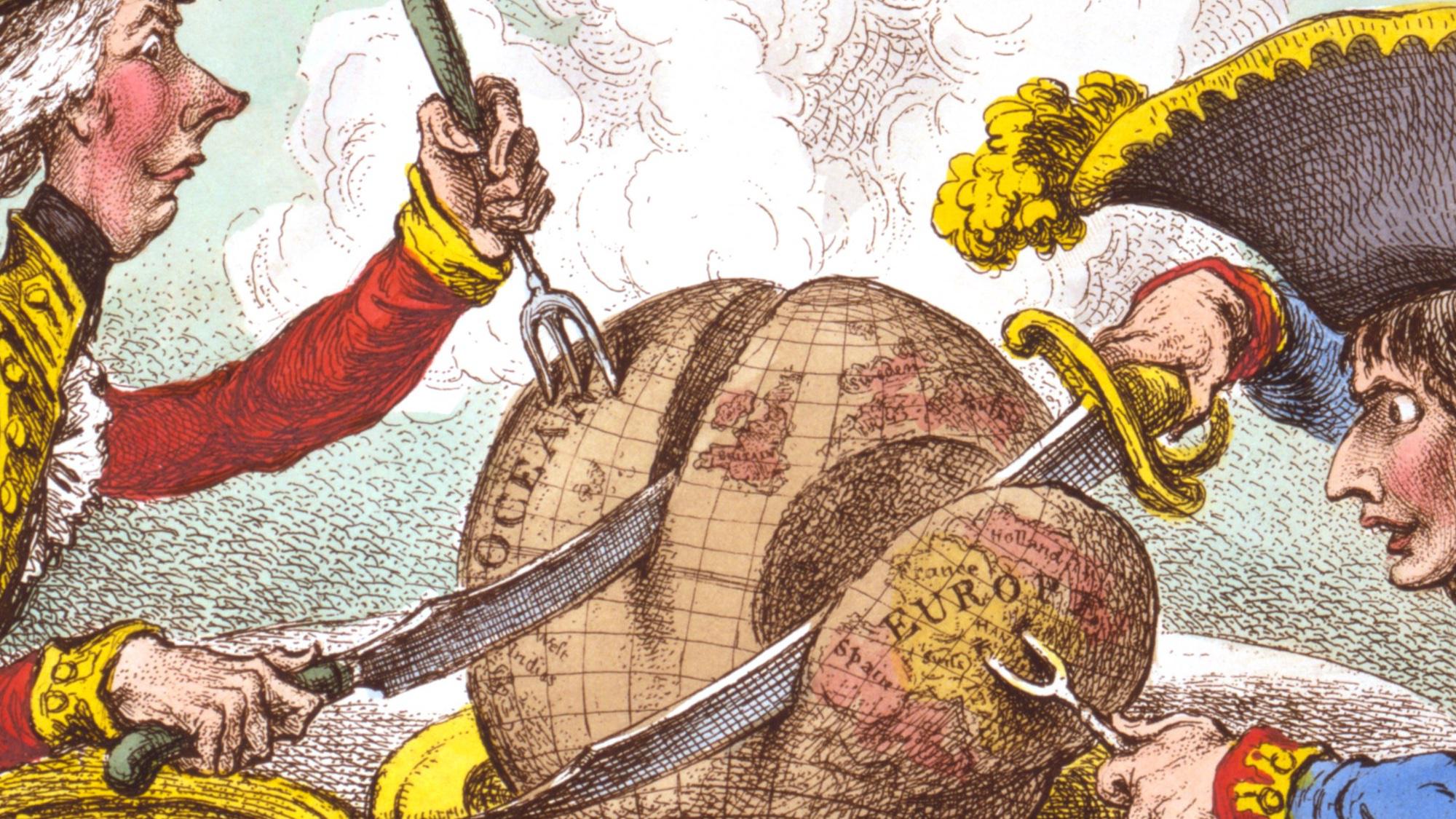
James Gillray’s ‘plumb-pudding’ caricature is “probably the most famous political cartoon of all time.”
The European currency features buildings that didn’t exist, until Spijkenisse made them in concrete
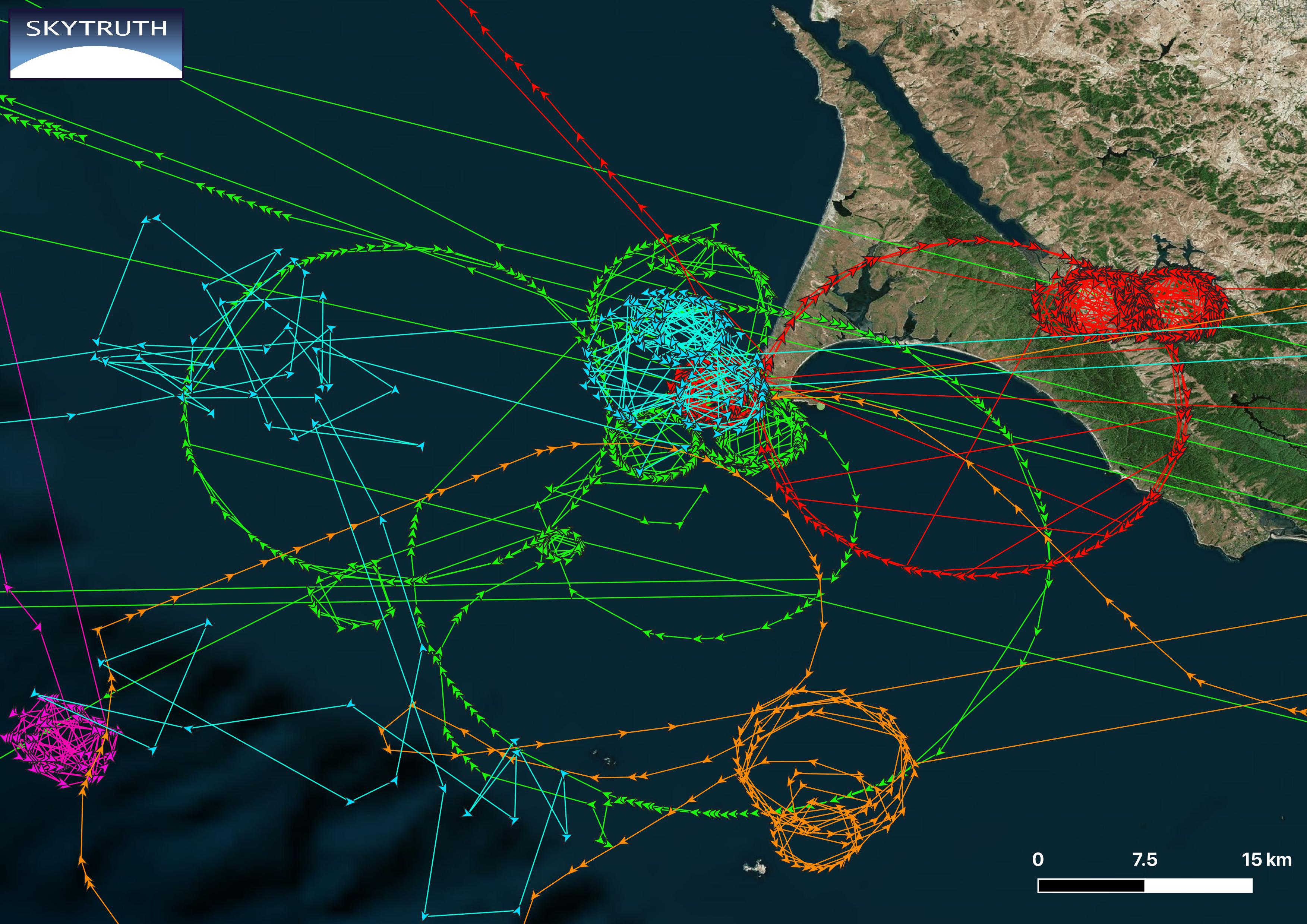
Circle spoofing is an advanced form of GPS manipulation – but nobody knows exactly how, or why.
Topologists can’t tell donuts from coffee mugs, but their maps are revelatory nonetheless.
‘Dorozoku’ map crowd-sources the whereabouts of noisy kids in Japan – but who’s being anti-social here, exactly?
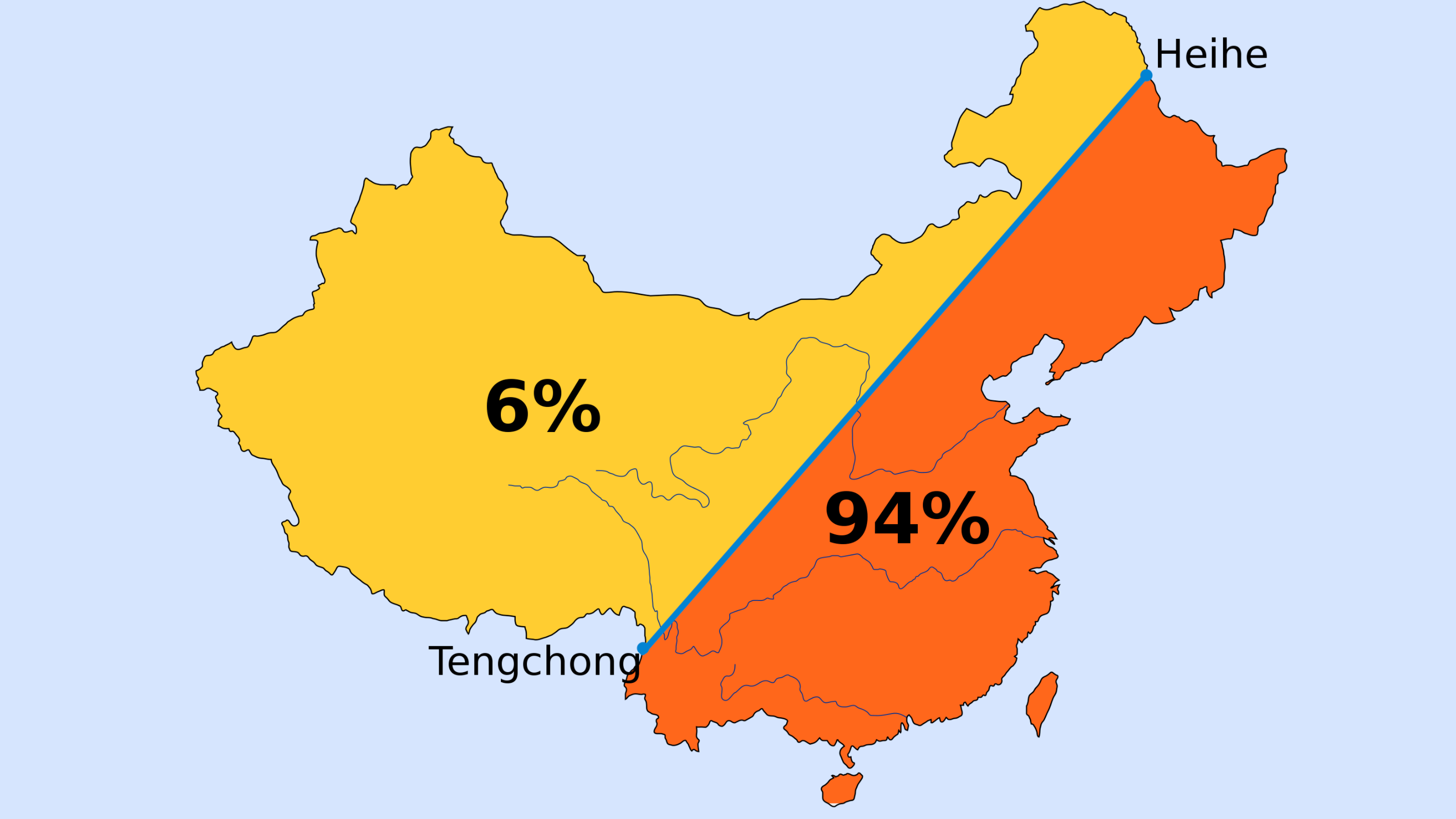
First drawn in 1935, Hu Line illustrates persistent demographic split – how Beijing deals with it will determine the country’s future.
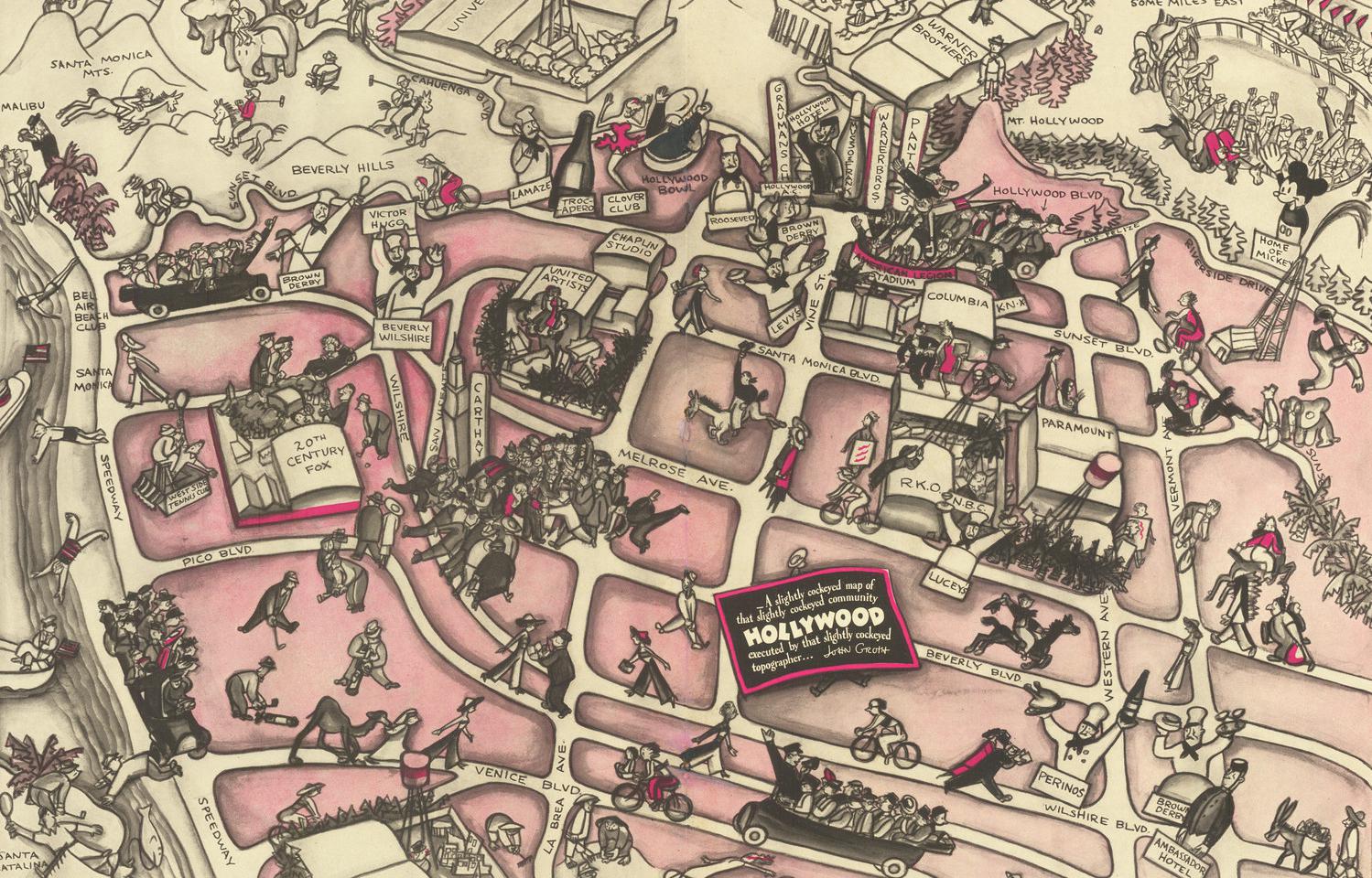
Legendary cartoonist John Groth’s pictorial map captures LA’s film factories in their Golden Age.
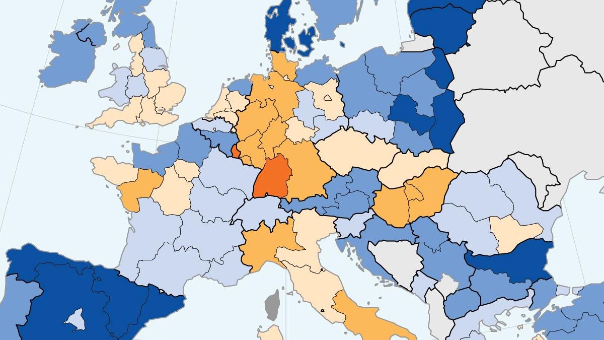
Despite overall increase over the past 20 years, share of women in science and engineering falls in some European countries
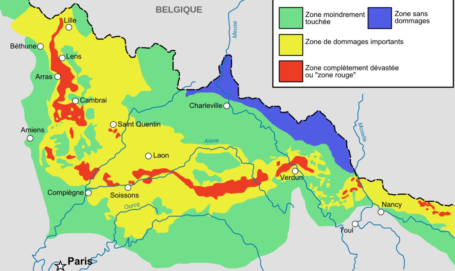
More than a century after the end of hostilities in 1918, some battlefields of WWI are still deadly enough to kill you.
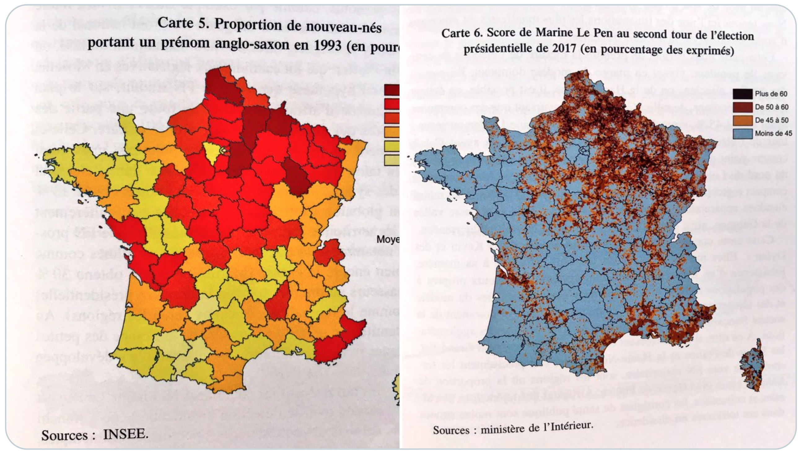
In Germany and France, having an Anglo-Saxon first name is a good predictor of extreme voting behavior.
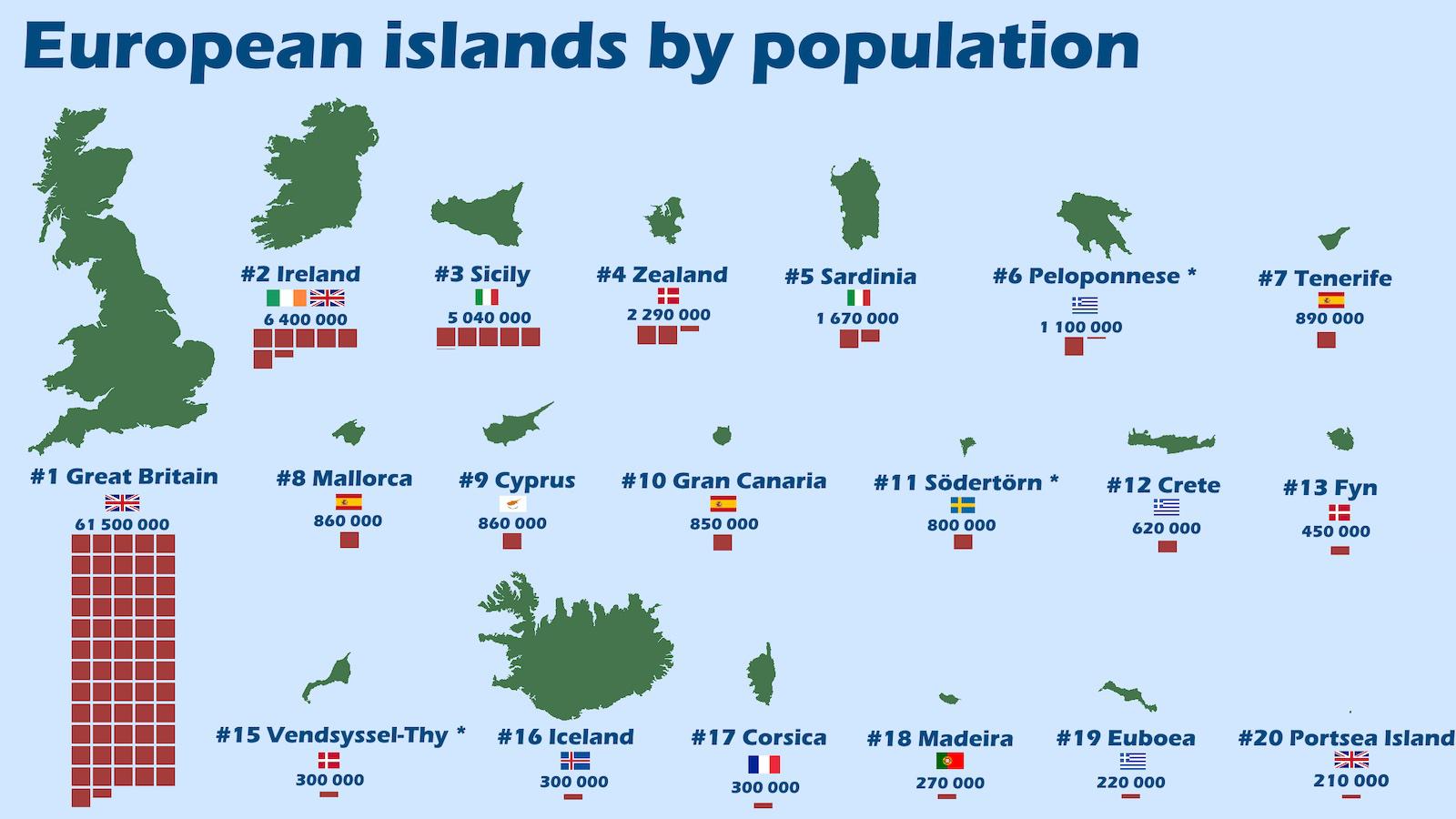
This map of Europe’s 20 most populous islands holds a few surprises and unlocks a truckload of trivia.
Already 14 billion miles from the Sun, Voyager 1 is speeding away at 38,000 mph.
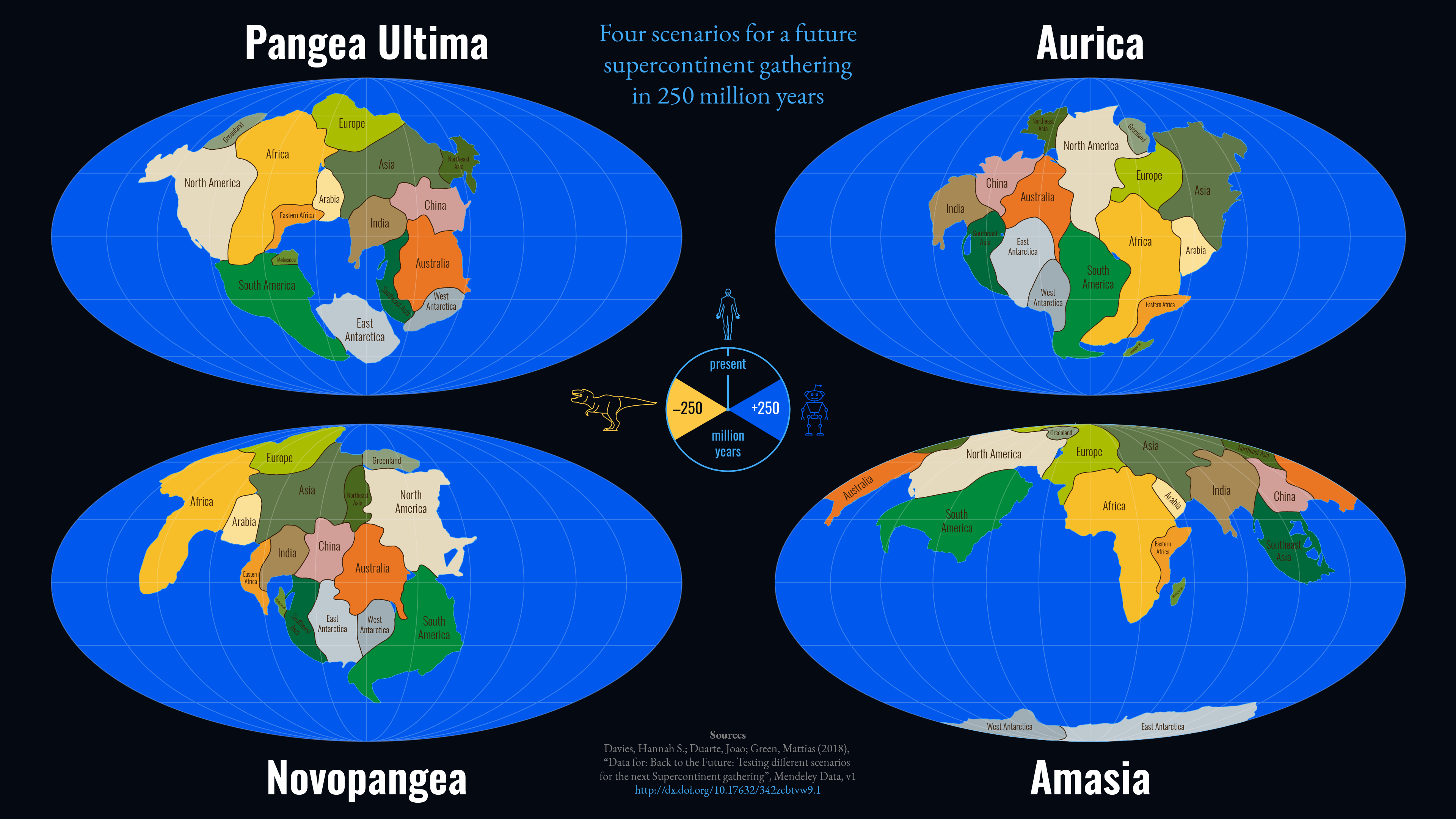
The arc of geological history is long, but it bends towards supercontinents – so, what will the next one look like?
Three decades after the demise of the GDR, its familiar contours keep coming back from the dead.
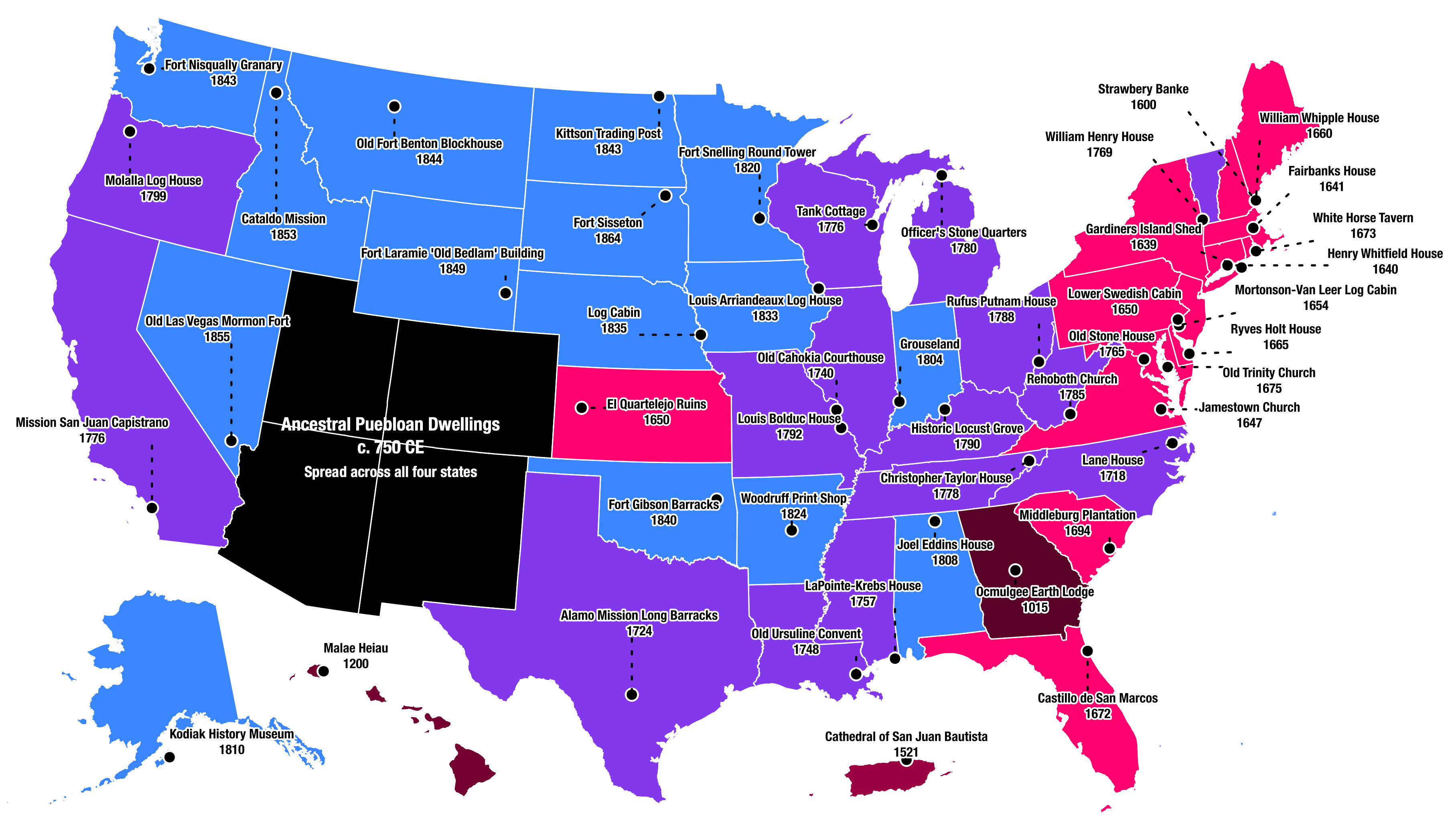
Map shows oldest buildings for each U.S. state – but also hints at what’s missing.
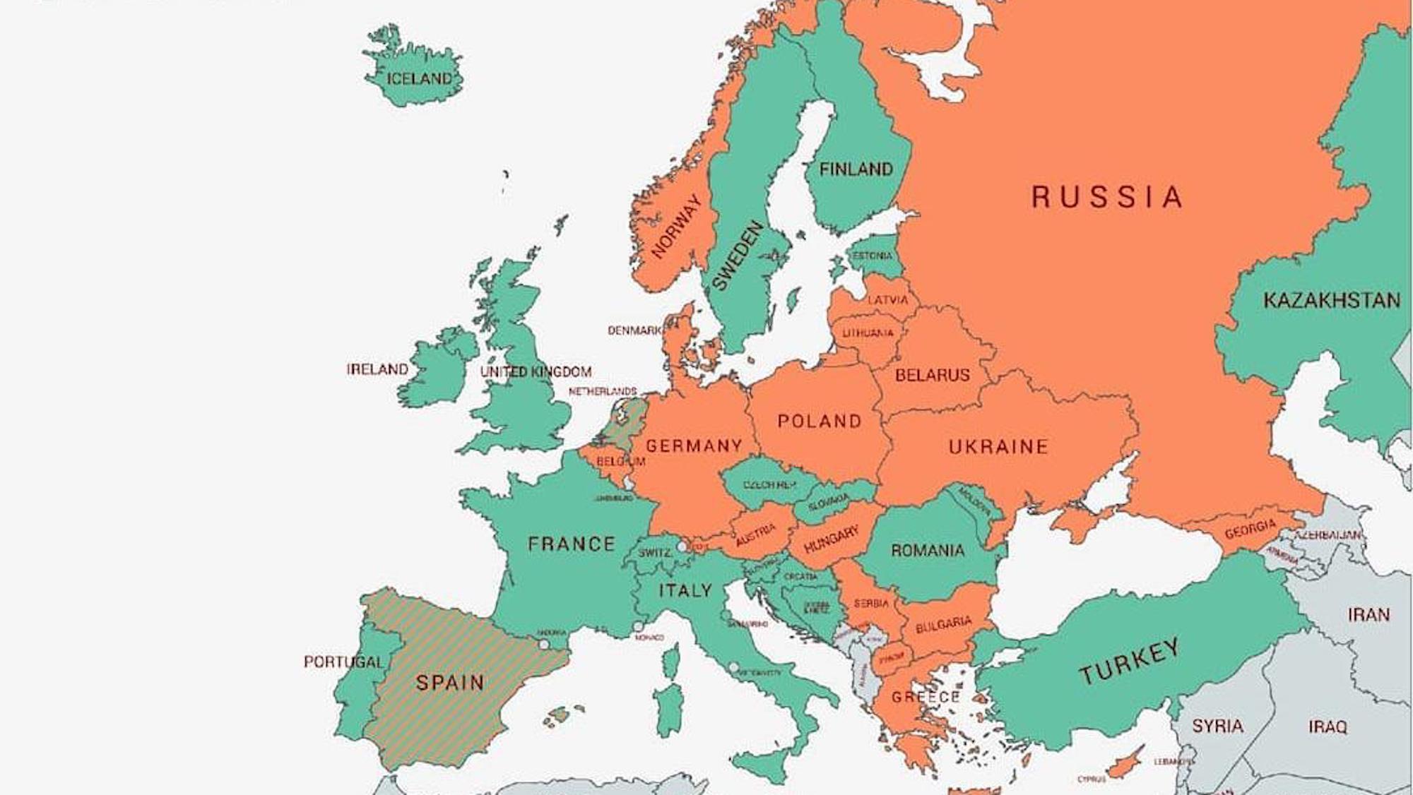
For a purely binary choice, wearing a ring either on the left or right hand can say a lot about the wearer.
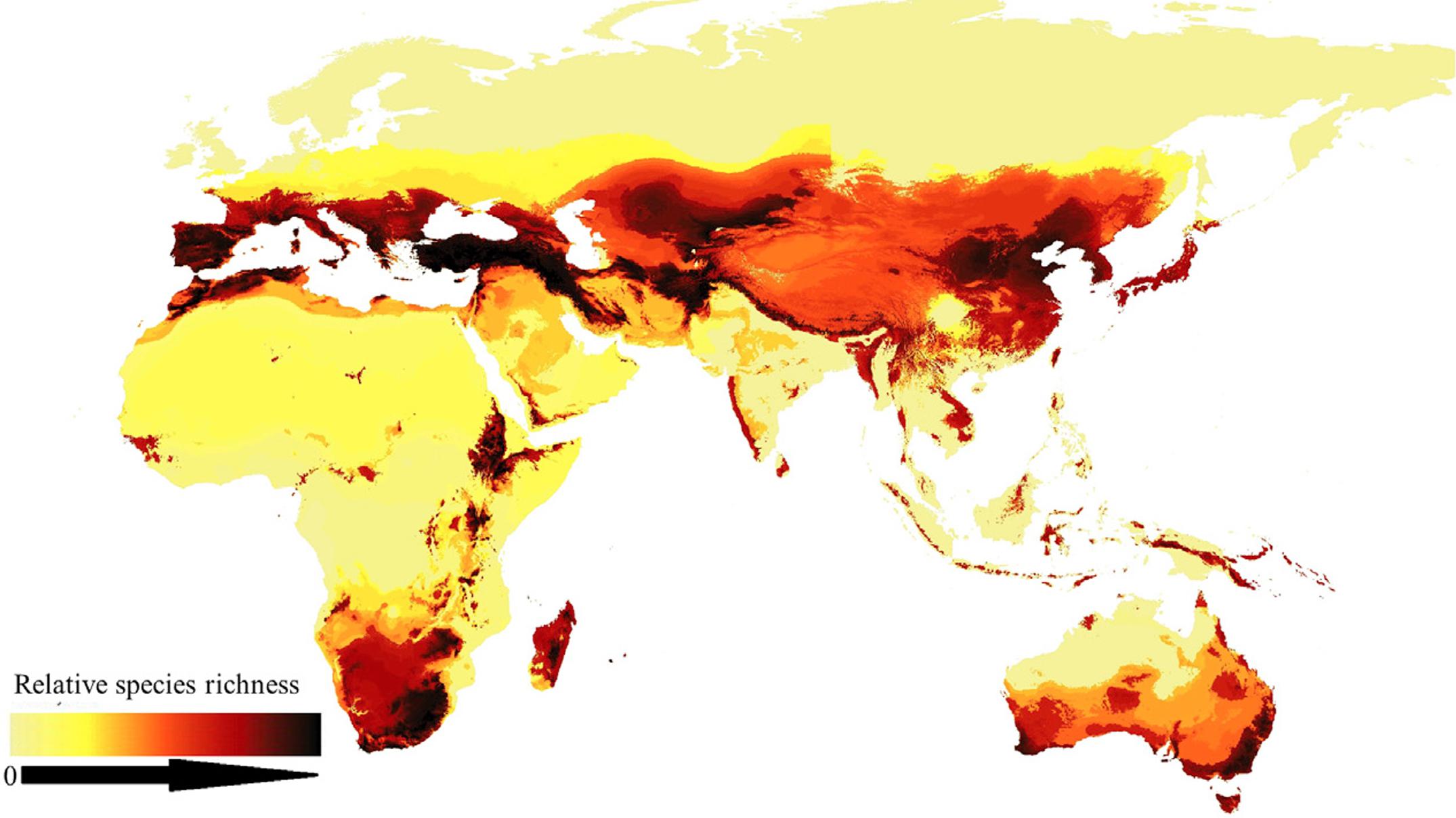
First picture of worldwide bee distribution fills knowledge gaps and may help protect species.
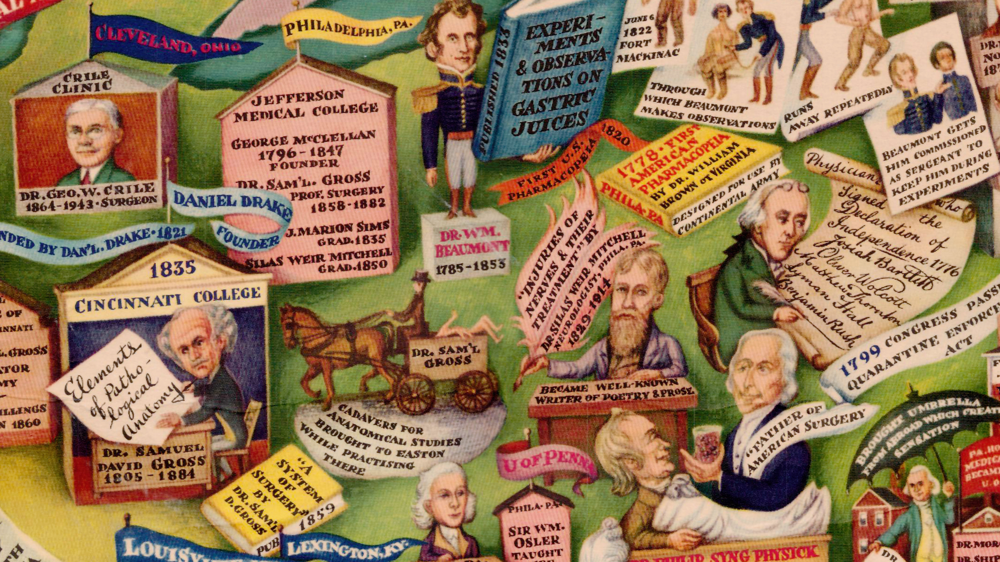
The unfamiliar landscape of America’s medical past is marked by bizarre incidents, forgotten breakthroughs and selfless sacrifice.
Underperforming, the U.S. comes in only 157th out of 196 in global triangularity ranking.
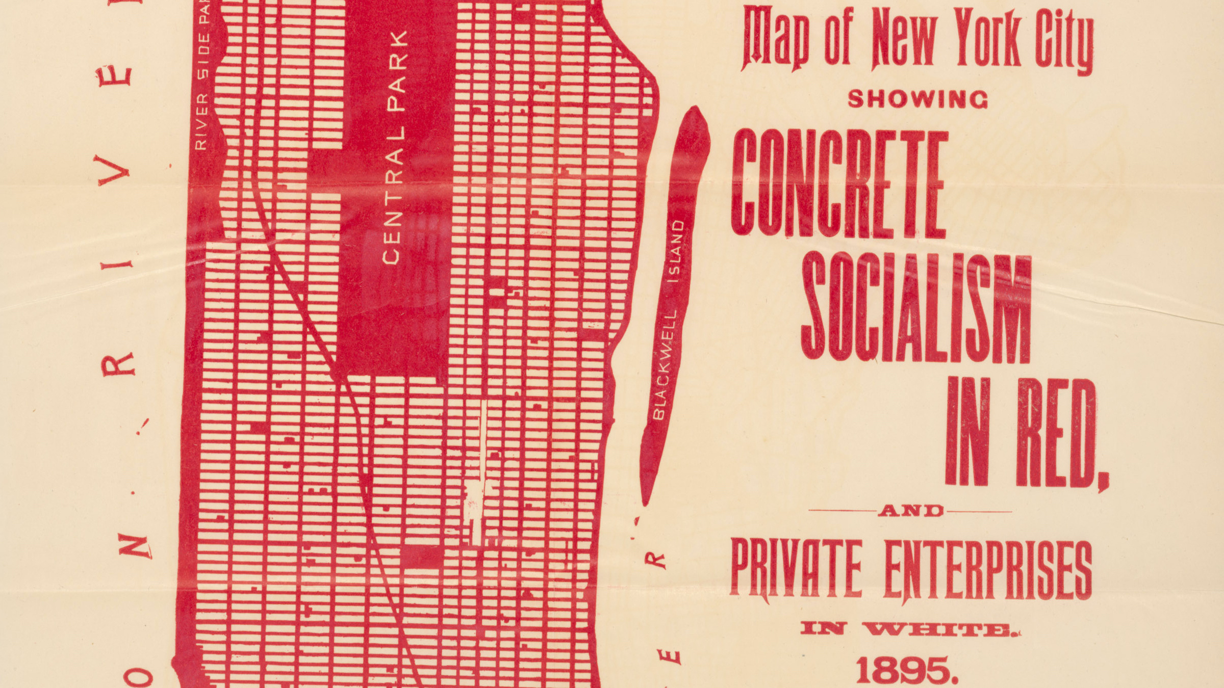
1895 map of New York City shows ‘concrete socialism’ in red, ‘private enterprises’ in white.
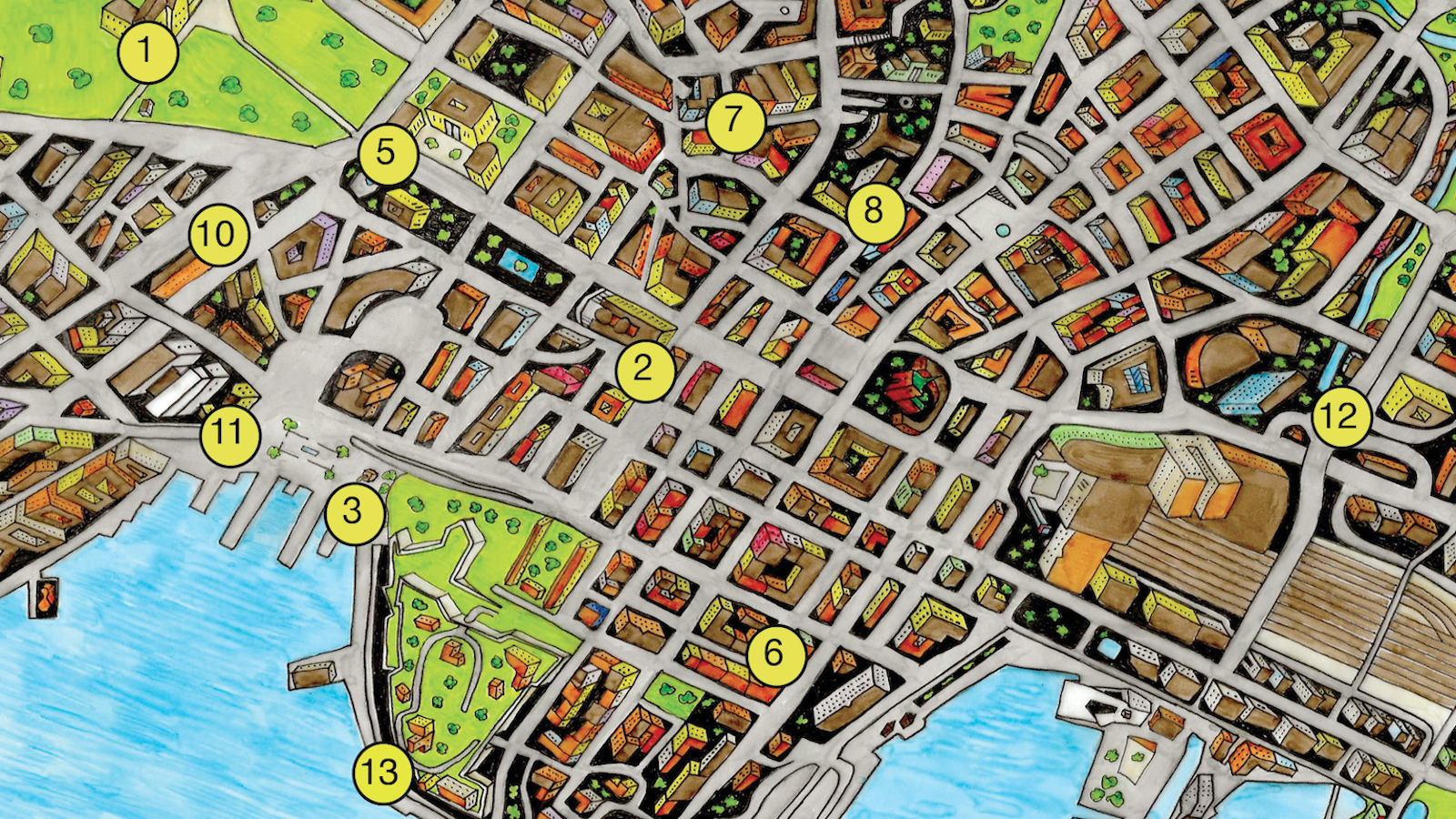
‘Critical Tourist Map of Oslo’ offers uniquely dark perspective on Norway’s capital.
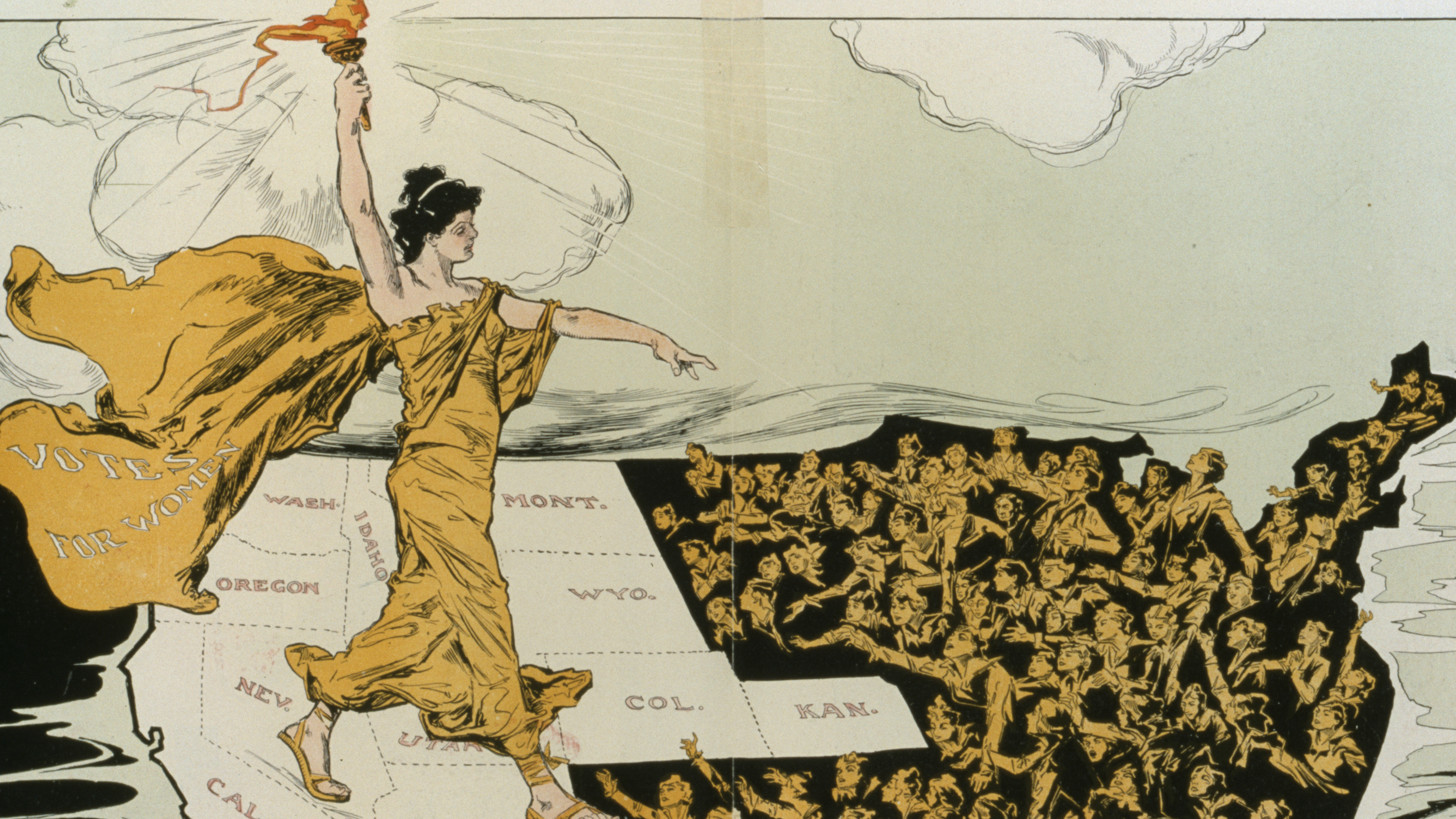
In this 1915 map, Lady Liberty shines her light in the West on women in the East, still in electoral darkness
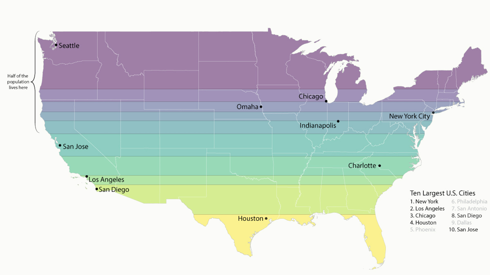
Why not just divide the United States in slices of equal population?
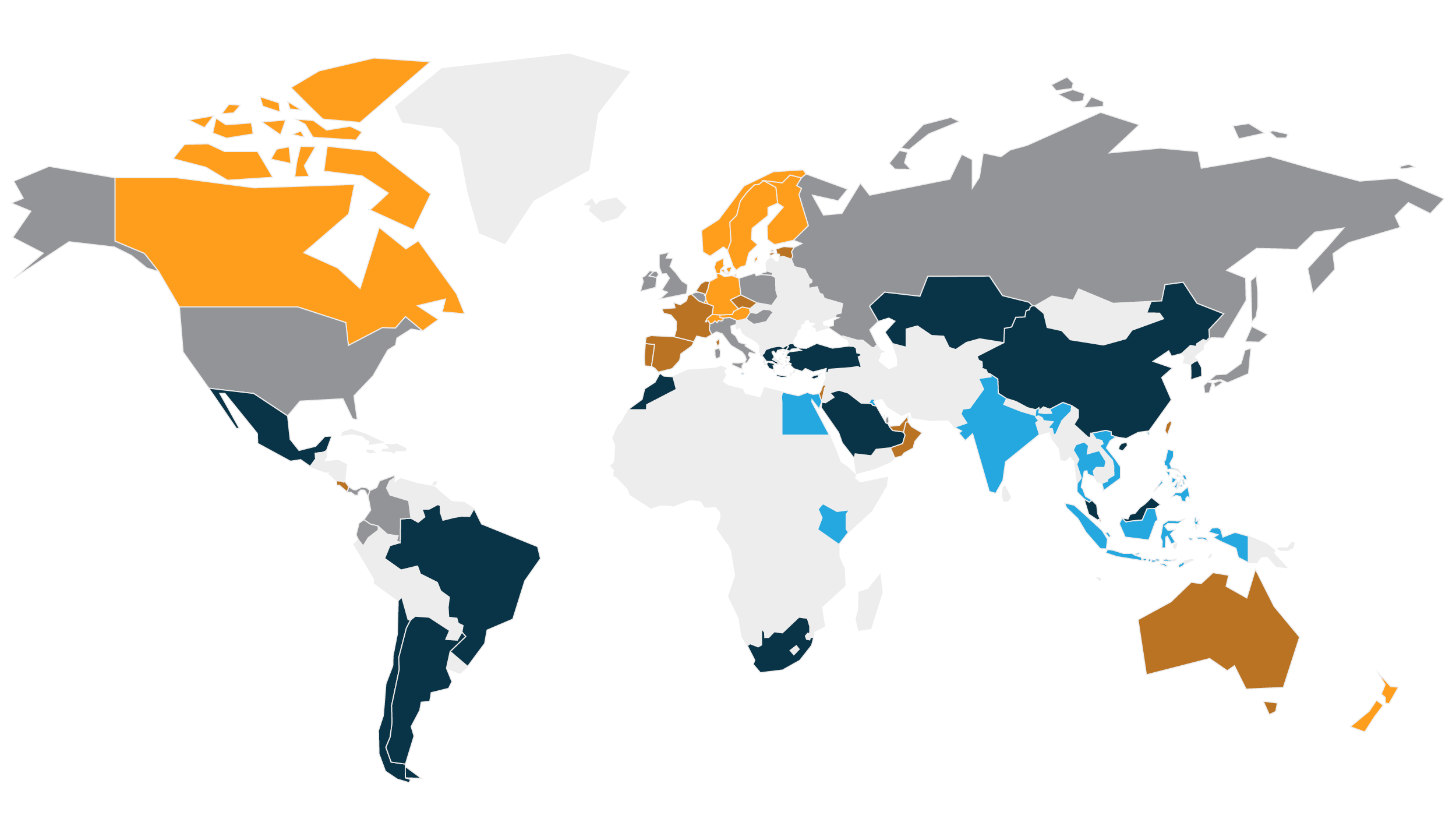
India finishes last of 60 countries in environment and sustainability, as ranked by the expats who work there.
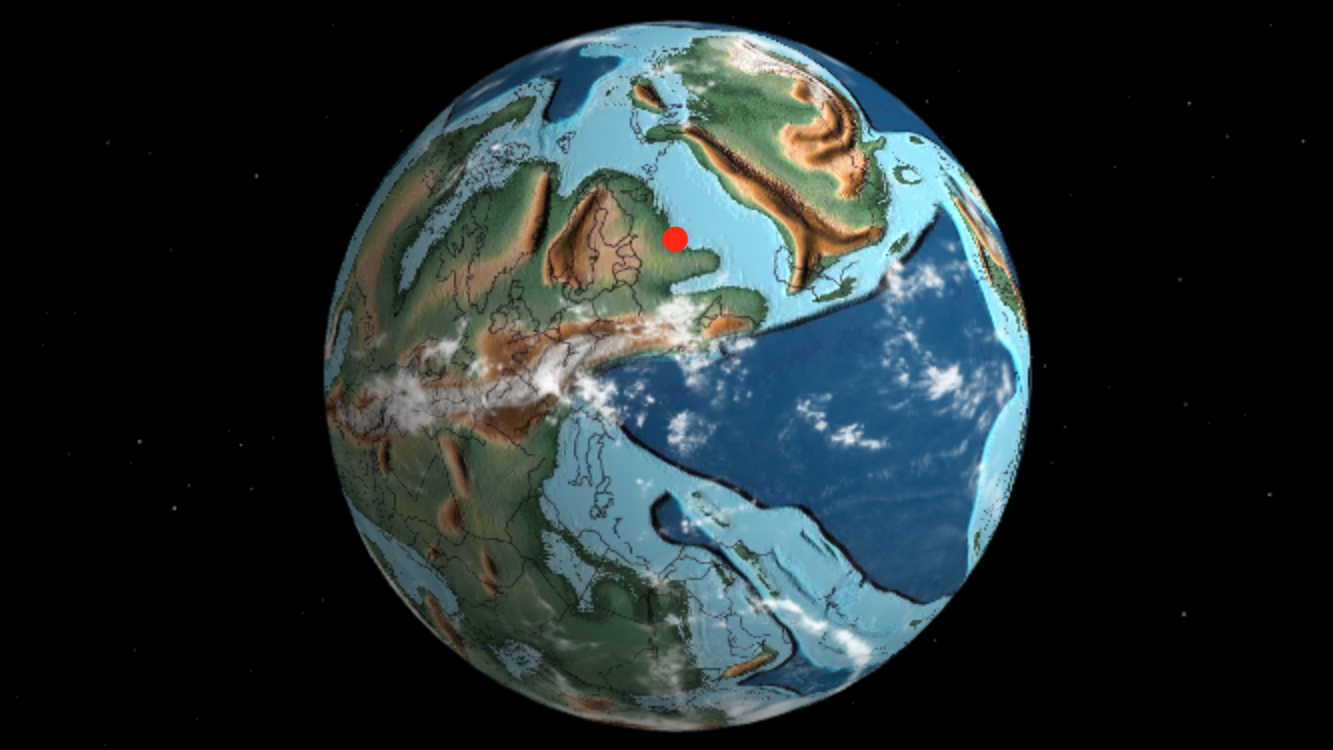
Interactive globe shows where your hometown was at various stages of Earth’s deep geological past.
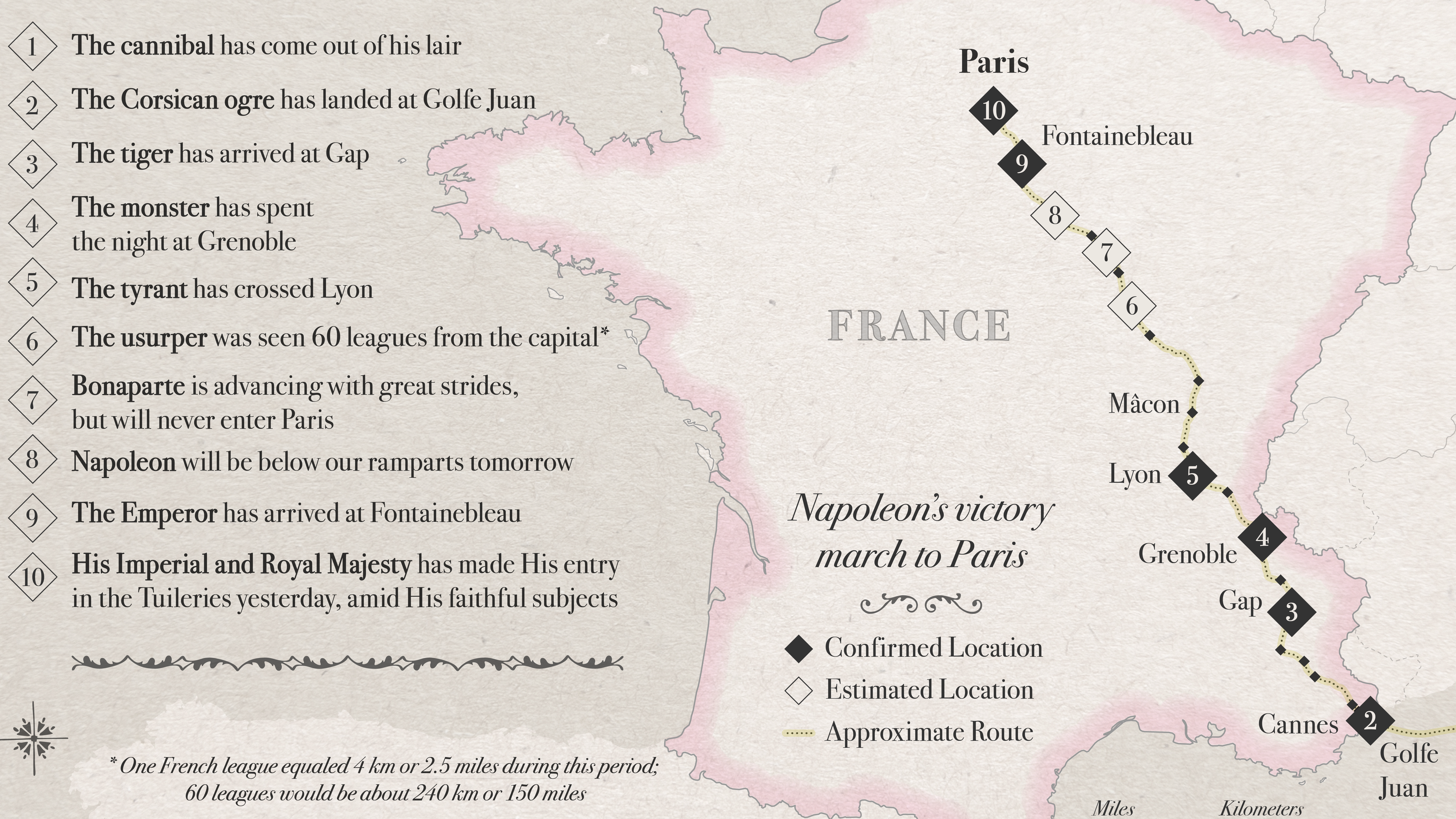
Alexandre Dumas’ famous anecdote about Fake News in the 1800s has a surprising twist.
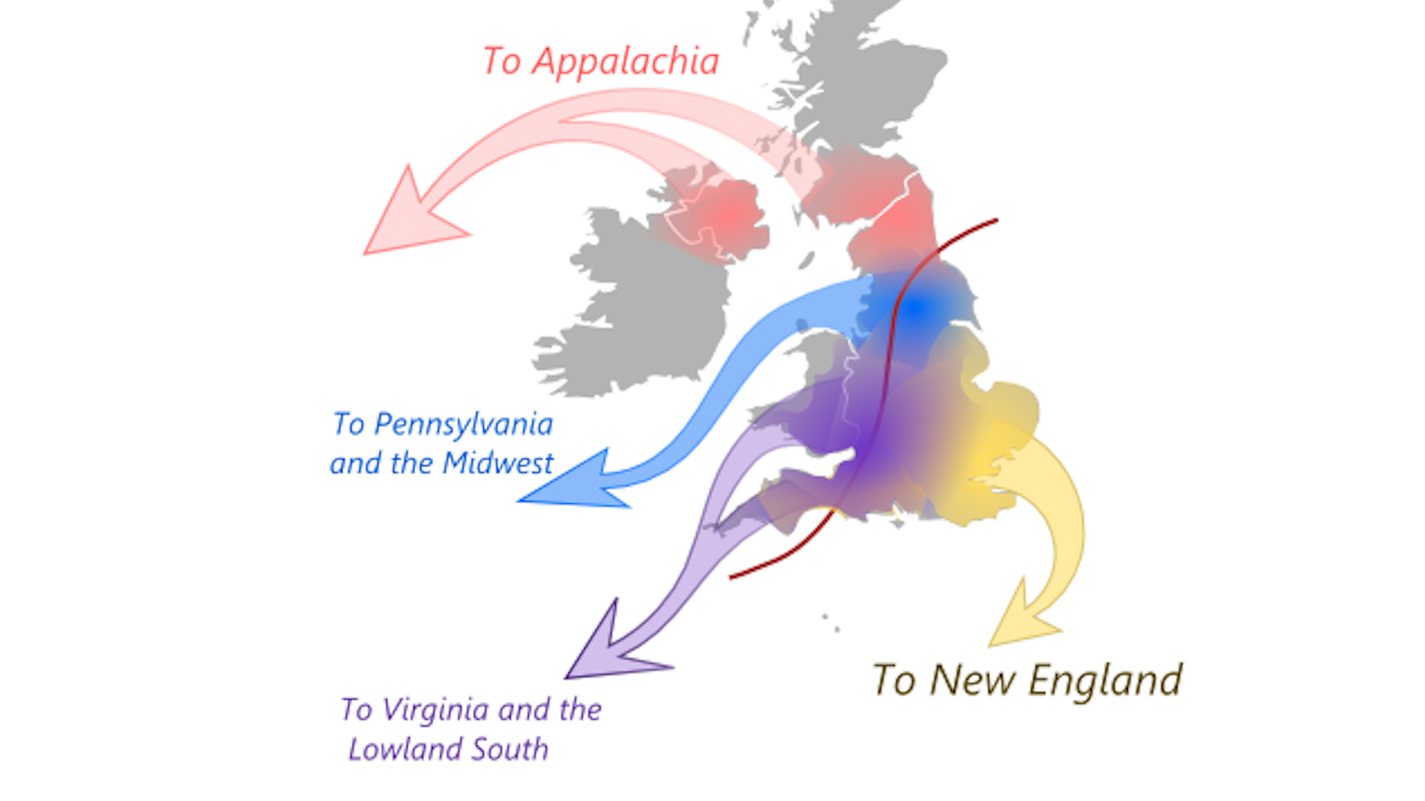
They came from different places and with different ideas, which still resonate today.
Remarkable ‘fan art’ commemorates 50th anniversary of legendary guitar player’s passing.
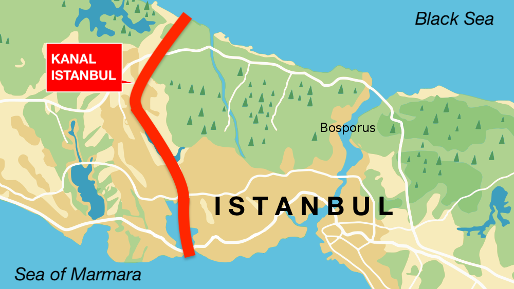
‘Kanal Istanbul’ would create a second Bosporus – and immortalize its creator.
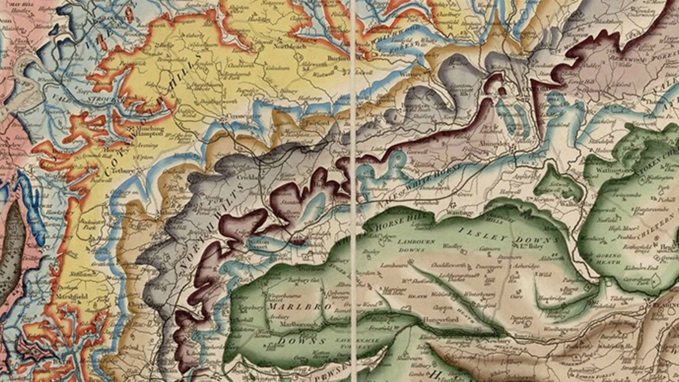
Two Williams pioneered geological mapping in Britain and the United States – but the world only remembers one.
