
Humanity is hardly an exclusive club. No secret handshake required. On November 15th, the United Nations predicts that we’ll be adding our eight billionth (living) member.
This is an alarming milestone to some, not just because of the number’s sheer magnitude — imagine London’s 90,000-seater Wembley Stadium, squared — but also due to the breakneck speed at which we’ve reached it. After all, it took us all of human history up to 1804 to reach our first billion. And then we needed just 123 years to get to the second one.
Quadrupled in less than a century
That was in 1927. Less than a century on, that figure has now quadrupled. But population growth is no runaway train. The global fertility rate has been dropping since 1964, down from 5 births per woman to just under 2.5 today.
As a result, the speed of population growth has already plateaued. Since 1960 — when we achieved our third billion — we’ve added billions at a stable interval, of about one every 12 to 14 years. The UN Population Division projects that those intervals will get longer again after billion number eight, and humanity will hit its peak — numerically speaking at least — by the end of the century, at just under 11 billion.
The ensuing population crunch will of course cause a bunch of worries and problems of its own. Yet knowing that the curve will eventually tilt downward is a welcome bit of good news. It marks a refreshing change from other, more intractable threats to our continued existence, like climate change, nuclear proliferation, and resource depletion.
All of this serves as a long-winded introduction to a remarkable realization: Instead of preludes to disaster, maps like these may become objects of future curiosity. A century or two from now, our successors, inhabiting a less crowded planet, may study them and marvel, “Look how many we once were!”
Why Bangladesh is bigger than Russia
These are not maps in the strictest sense; they are in fact complex pie charts, showing the relationship between populations of individual nations, regions, and continents to each other, and to the whole.
As alternatives to purely territorial maps, they offer surprising insights. A classic example is the fact that Russia, the largest country in the world, has a population considerably smaller than Bangladesh, that comparatively tiny country jammed in between India and the Bay of Bengal. However, as mere snapshots, these charts say nothing about the growth or decrease of the pie and its pieces. Russia’s population is shrinking, while Bangladesh’s is still growing, so the discrepancy between both will continue to increase.
Perhaps more relevant to the geopolitics of the future, India and China — now roughly equivalent at about 1.4 billion each — will shrink, but at a very different rate. By 2100, the UN predicts there could be as few as 500 million Chinese, while there still would be about one billion Indians.
So, what do these snapshots of global population at the cusp of our eight billionth member tell us?
An Asian planet
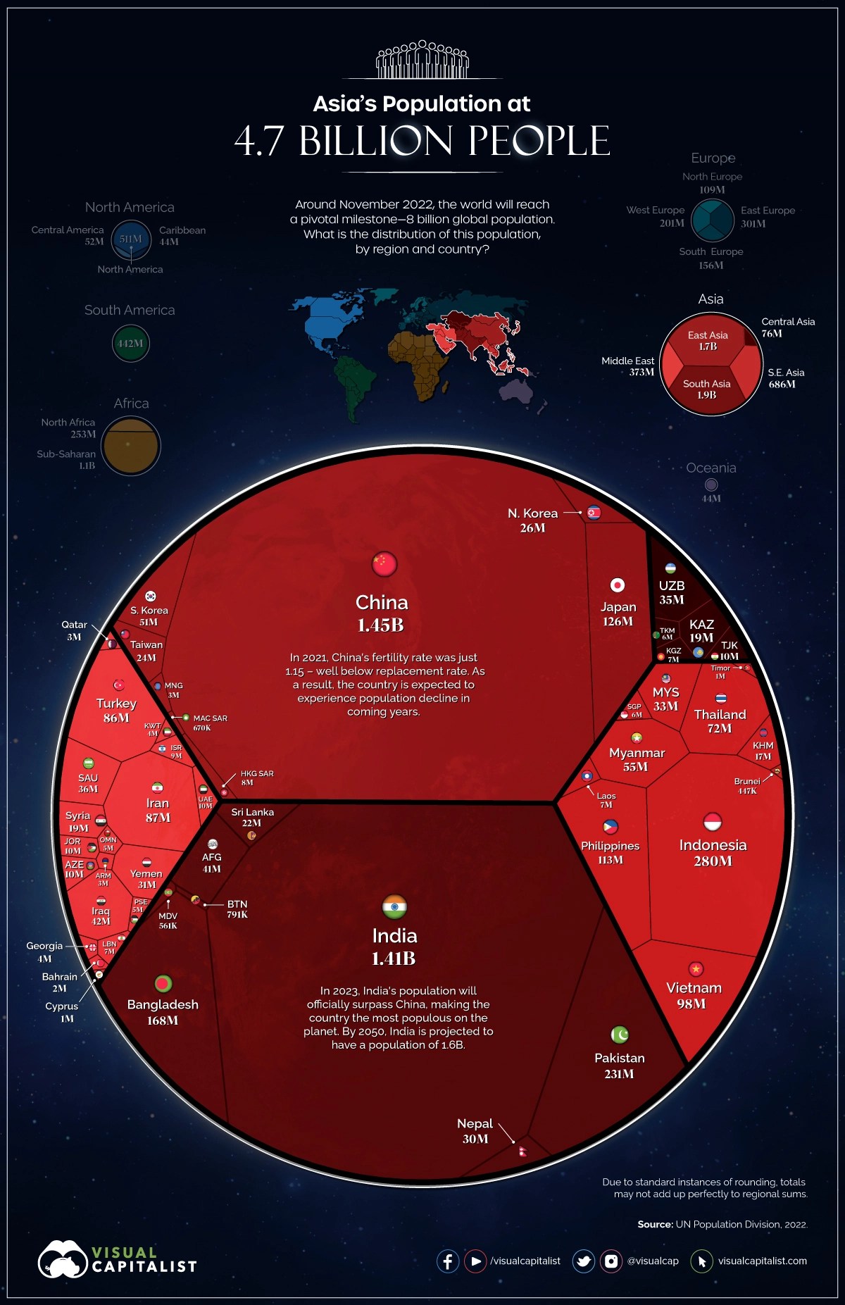
At a global level, this is an Asian planet. All the other continents combined don’t even come close. On its own, Asia (4.7 billion) represents 58% of humanity. Second-placed Africa (1.4 billion) constitutes 17.5%, followed by Europe (750 million, 9%), North America (602 million, 7.5%) and South America (439 million, 5.5%). Oceania at 44 million is barely 0.5%.
The DRC, soon 100 million strong
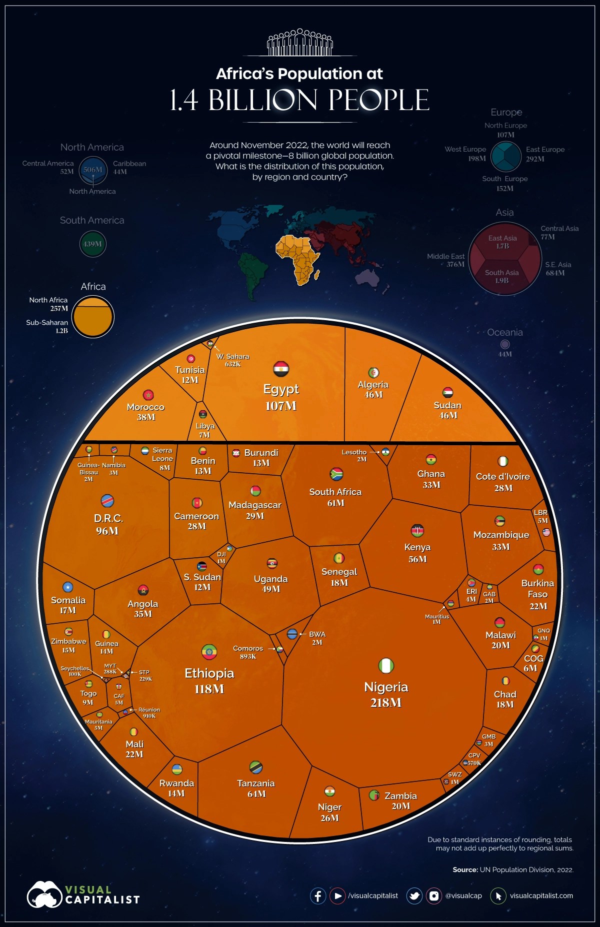
This chart makes a neat distinction between North Africa (257 million in total), mostly Muslim and largely Arab, and the ethnically and culturally distinct sub-Saharan part of the continent (1.2 billion in total). Egypt (107 million) dominates the north (and indeed the entire Arab world). Ethiopia (118 million) and Nigeria (218 million) are the population hotspots below the Sahara.
These three are the only countries with populations over 100 million, but as Africa is the continent predicted to have the lion’s share of future population growth this century, that club is likely to expand. The DR Congo (96 million) is the most likely first candidate.
Asia’s regional superpowers

Asia is vast, allowing for regional population superpowers like Turkey (86 million) and Iran (87 million) in the Middle East (373 million in total) and Indonesia (280 million) and the Philippines (113 million) in Southeast Asia (686 million in total). But the longest shadows are cast by not-so-neighborly neighbors India and China (both about 1.4 billion). What will happen when, as mentioned above, their population sizes start to diverge toward the end of this century?
Germany + France = Russia
Credit: Visual Capitalist
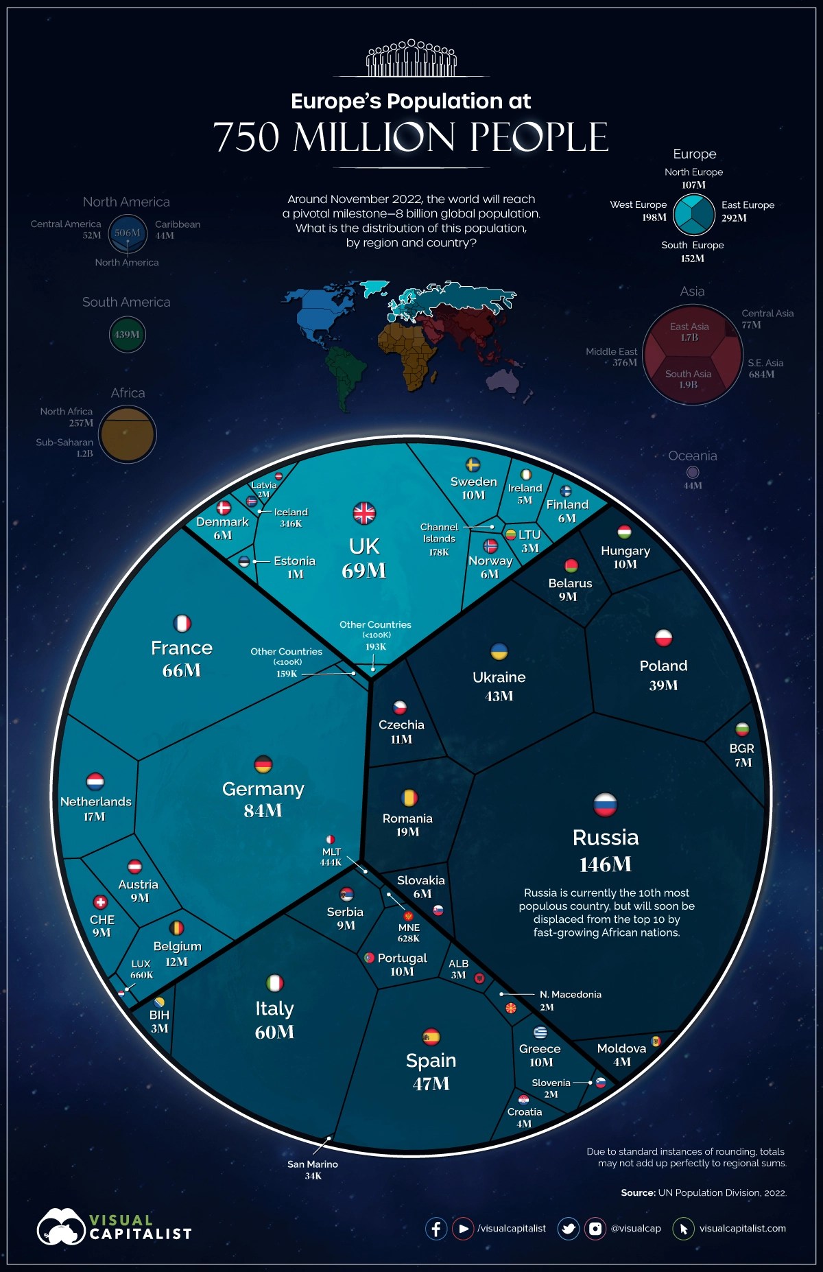
Russia (146 million) is Europe’s most populous nation, but not by as big a margin as China in Asia (or the U.S. in North America). Combined, Germany (84 million) and France (66 million) have more people. Those two countries represent most of Western Europe (198 million in total), as Italy (60 million) and Spain (47 million) dominate Southern Europe (152 million in total), and the UK (69 million) Northern Europe (107 million in total). Added up, these so-called “Big Five” countries represent 44% of Europe’s total population and the bulk of its economy.
For once, Mexico is bigger than Canada
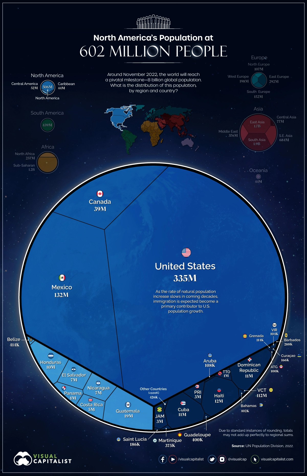
Representing well over half the continent’s population, the U.S. (335 million) dominates North America (507 million in total) — just as it does on a “normal” (geographical) map. For once, however, Mexico (132 million) is much larger than Canada (37 million). Guatemala (19 million) has the largest population in Central America (52 million in total), and Haiti (12 million) is the population superpower of the Caribbean (44 million in total), edging out Cuba and the Dominican Republic (both 11 million).
Why does Brazil look familiar?
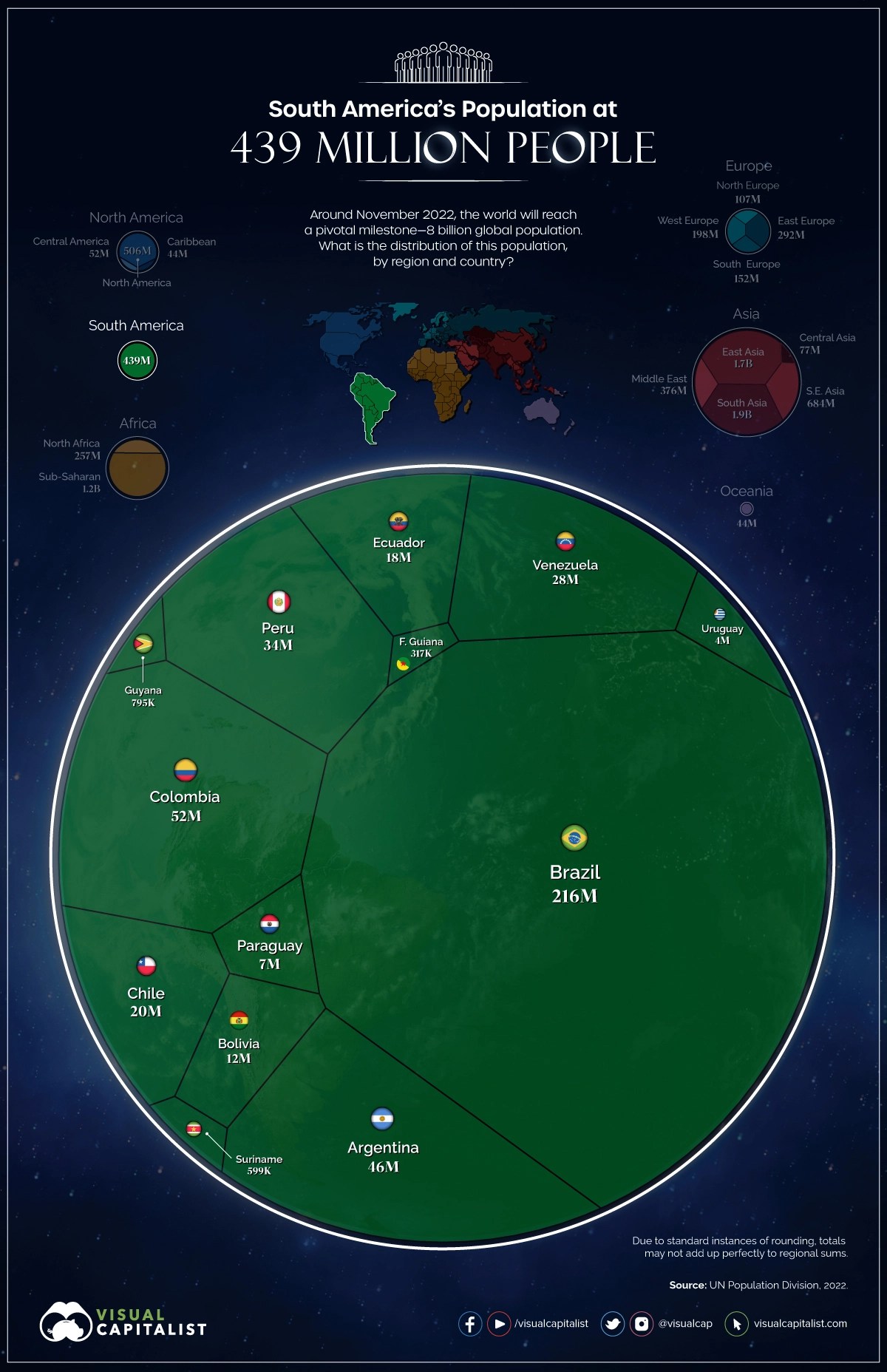
Curiously, this chart of South America looks a bit like the map of South America. That’s because Brazil (216 million) takes up about half the continent, both in terms of area and population. Colombia (54 million) is South America’s second-most populous country, but by a very long margin. Only Argentina (46 million) is in roughly the same league.
Australia, Oceania’s biggest fish

Oceania is the least populous continent (44 million, which is about as much as Greater Tokyo). In that little pond, Australia is the biggest fish (26 million, or close to 60% of the total). Second? Not New Zealand (5 million), but Papua New Guinea (9 million). No other Oceanian country or territory has more than a million inhabitants; Fiji (911,000) comes closest.
8 billion strong, but tiny
Do those 8 billion people add up to a world overflowing with humans? Let’s correct the navel-gazing so typical of our species and appreciate the wider perspective.
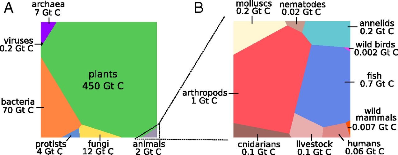
The chart on the left represents the Earth’s entire biomass (that is, the total weight of all living organisms), which adds up to 545.2 Gt C. (“Gt C” stands for gigatons of carbon, and 1 gigaton is 1015 grams, 1 billion metric tons, or 2.2 trillion pounds.)
Most of our planet’s biomass is made up of plants (450 Gt C, or 82.5%). The second-largest is bacteria (70 Gt C, or 12.8%), followed by fungi (12 Gt C, or 2.2%). Animals (which include us) make up just 2 Gt C (0.2%). The chart on the right isolates the animal kingdom, half of which is made up of arthropods (1 Gt C). The second-largest phylum are fish (0.7 Gt C, or 35%). Humans (0.06 GtC) represent no more than 3% of animal biomass (and 0.01% of total biomass).
That’s less than half compared to all the world’s mollusks. But then again, those mollusks don’t all want a car, a fridge, and a million other things all wrapped in plastic.
Strange Maps #1174
Population graphs are here at Visual Capitalist.
Biomass graphs are here at PNAS, the Proceedings of the National Academy of Sciences of the United States of America.
Got a strange map? Let me know at strangemaps@gmail.com.
