Weekend Diversion: The greatest album covers as seen from behind
From the Beatles to Nirvana, this artist’s imaginings make the originals even better!
“I feel very adventurous. There are so many doors to be opened, and I’m not afraid to look behind them.” –Elizabeth Taylor
When I think back to my childhood, there was nothing that made me feel a sense of my own identity as a part of the larger world for the first time quite like the music I listened to, and the albums that lived beside my (at the time) cassette player and later, CD player. There was nothing quite like getting a new album and checking out the cover and reading through the liner notes, all while the music engulfed me. Have a listen to Nick Drake’s Things Behind The Sun,
while I share with you the incredible album-inspired artwork of Harvezt.
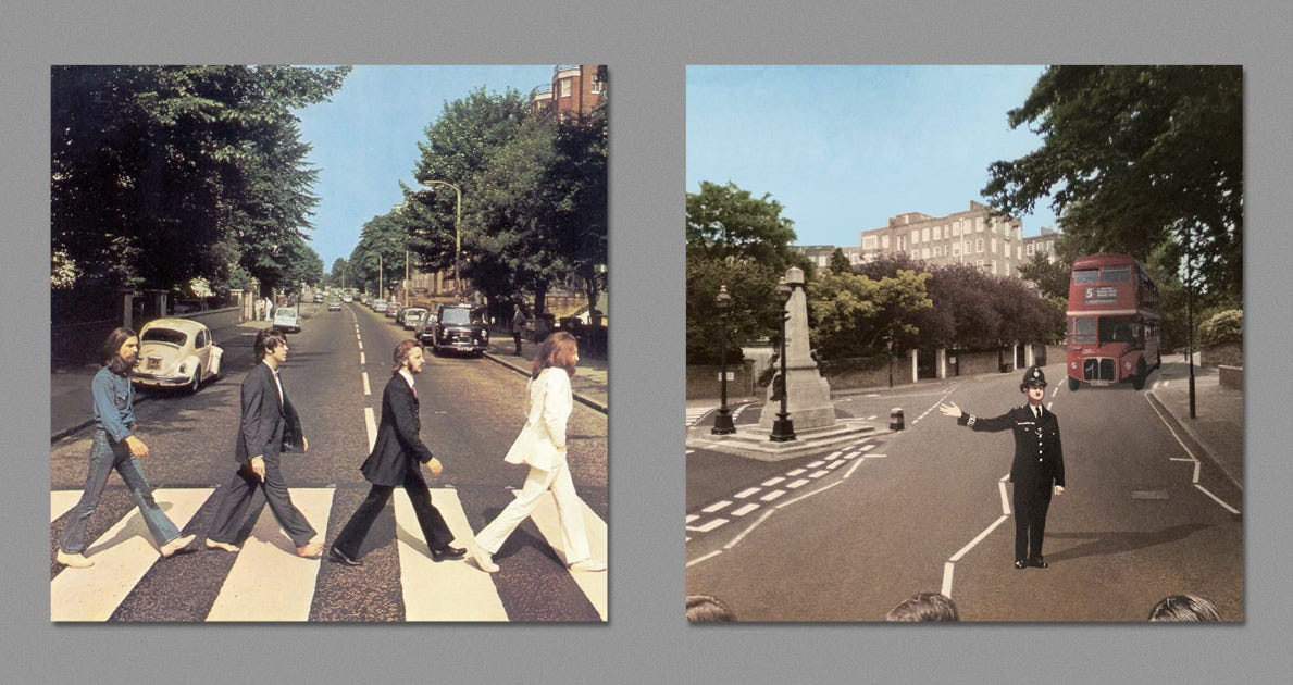
There are some album covers that probably stick in your mind as the “most iconic” when you think about them. Maybe it’s the Beatles’ Abbey Road album, Nirvana’s Nevermind album, or Springsteen’s Born in the U.S.A.

What Harvezt has done is imagine what these covers might look like when viewed from behind, and the result is not only visually arresting, it adds a new layer of depth to the album itself!
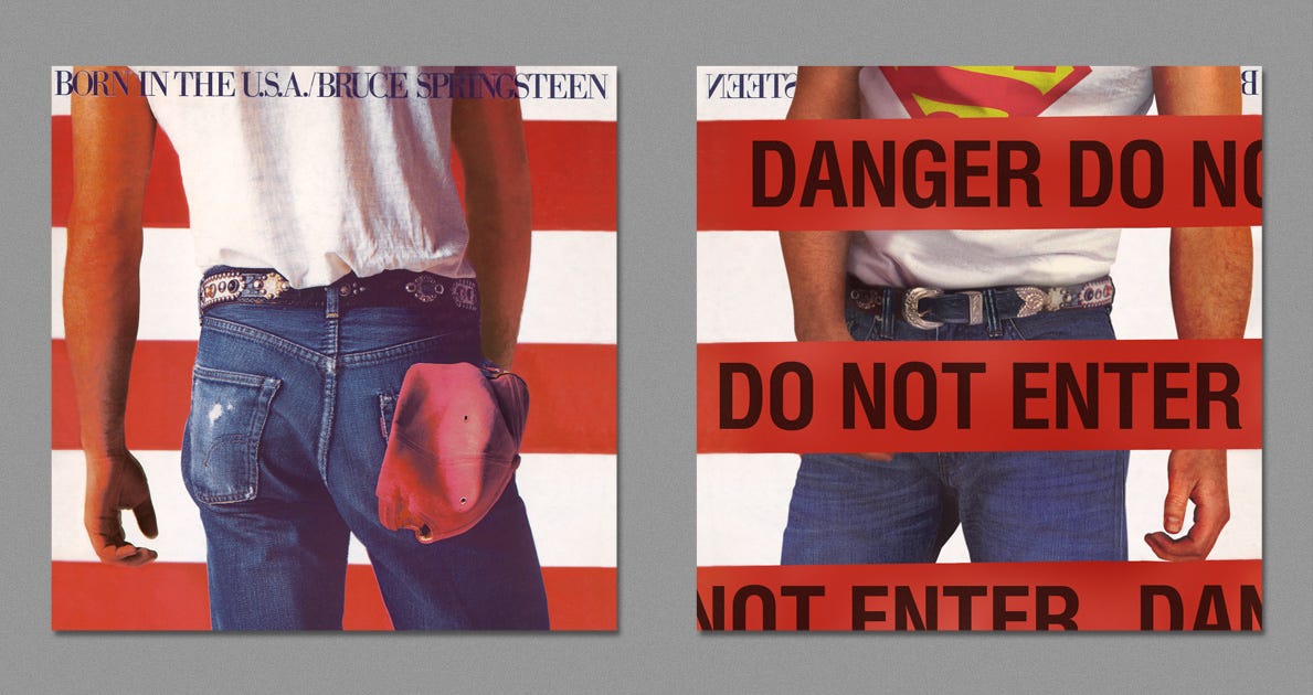
Interestingly enough, he’s also provided little album (and album artwork) biographies for each entry in his album; for Springsteen’s, for example:
Born in the U.S.A. is the seventh studio album by American rock singer-songwriter Bruce Springsteen, released on June 4, 1984.
The title track “Born in the U.S.A.” inspired the celebrated Annie Leibovitz photo of Springsteen’s backside against the backdrop of an American flag. Its cover became an iconic image of the era.
Some people thought that the cover depicted Springsteen urinating on the flag. He denied it: “That was unintentional. We took a lot of different types of pictures, and in the end, the picture of my ass looked better than the picture of my face, that’s what went on the cover. I didn’t have any secret message. I don’t do that very much.”
Design, Art Direction — Andrea Klein
Photography By — Annie Leibovitz
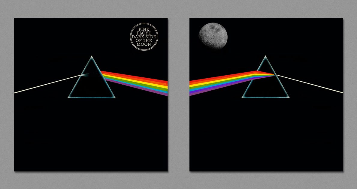
Harvezt has taken on a huge number of classic albums, including Pink Floyd’s Dark Side of the Moon,
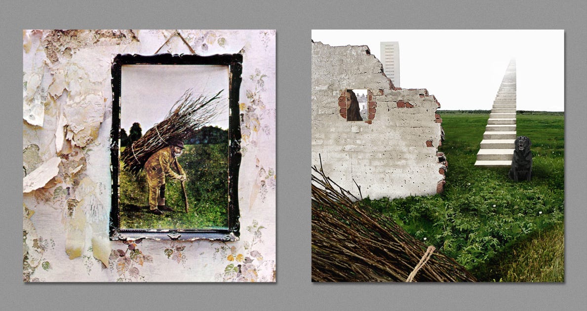
Led Zeppelin’s untitled fourth album (we always called it “IV”),
and one of my absolute favorites from my youth: the Beastie Boys’ Licensed to Ill.
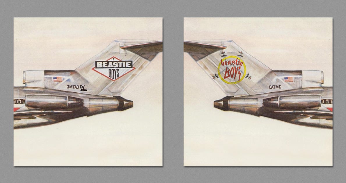
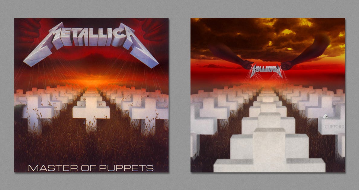
There are many more, too, that I think the artwork really adds something extra to. Remember Metallica’s Master of Puppets, with the little strings connecting to the tombstones? Imagine what that might look like from behind, along with a little memorial to Metallica’s original bassist.
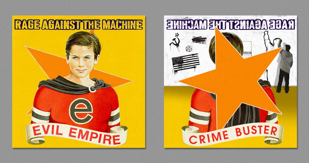
Rage Against The Machine’s “Evil Empire” came out in 1996, and their angry, politically-charged rap-metal fusion was one of the defining albums of my last year of high school. The reimagined rear of this pays homage to the original artwork that the album cover was based on, plus makes the symbolism of political activism more of a central showpiece.
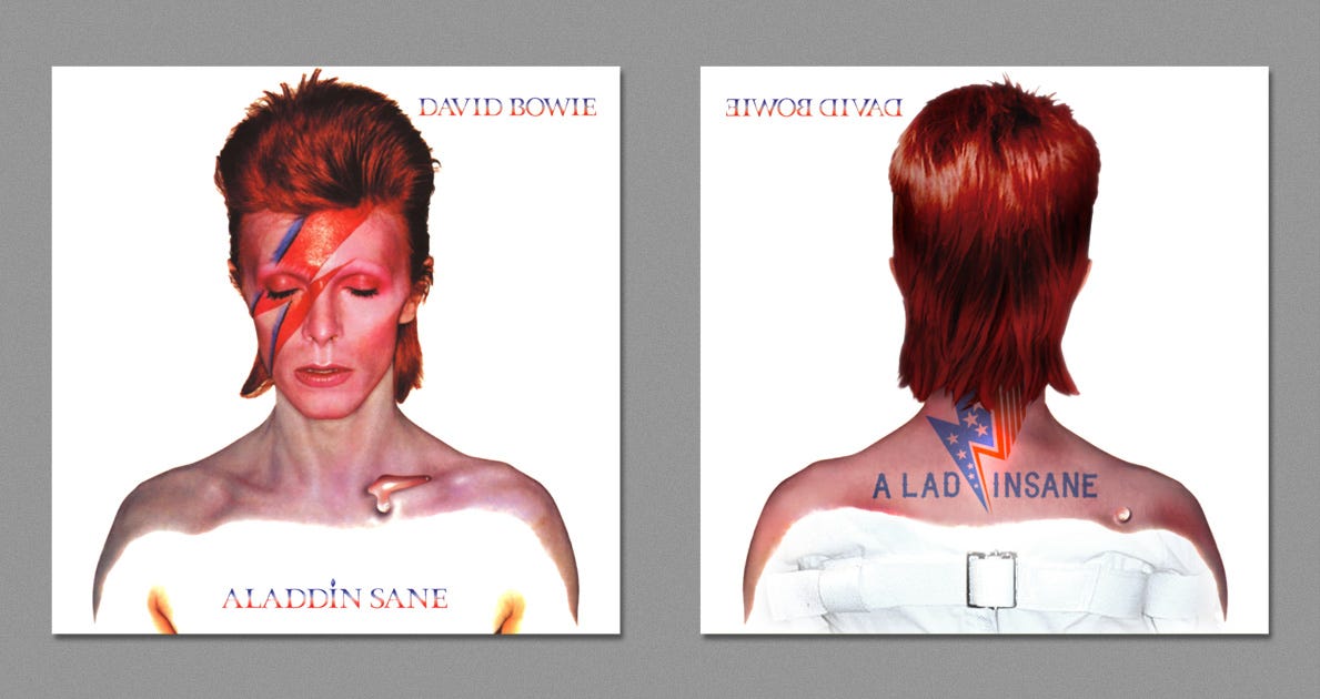
There are some others that are really well done, including David Bowie’s Aladdin Sane, with a very clever use of a single buckle-and-strap to unmistakably implant the image of a straightjacket in your mind,
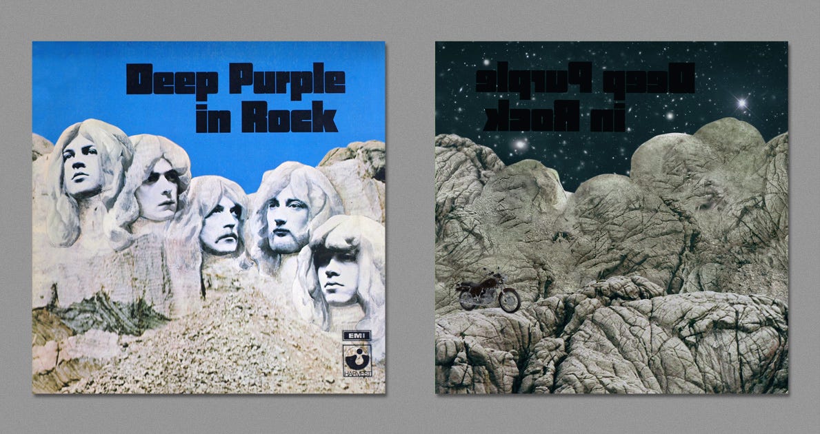
Deep Purple In Rock was one of the most influential hard rock albums of all-time, and the reverse side just, well, makes it undeniably more badass. (Plus, what astrophysicist wouldn’t love it?)
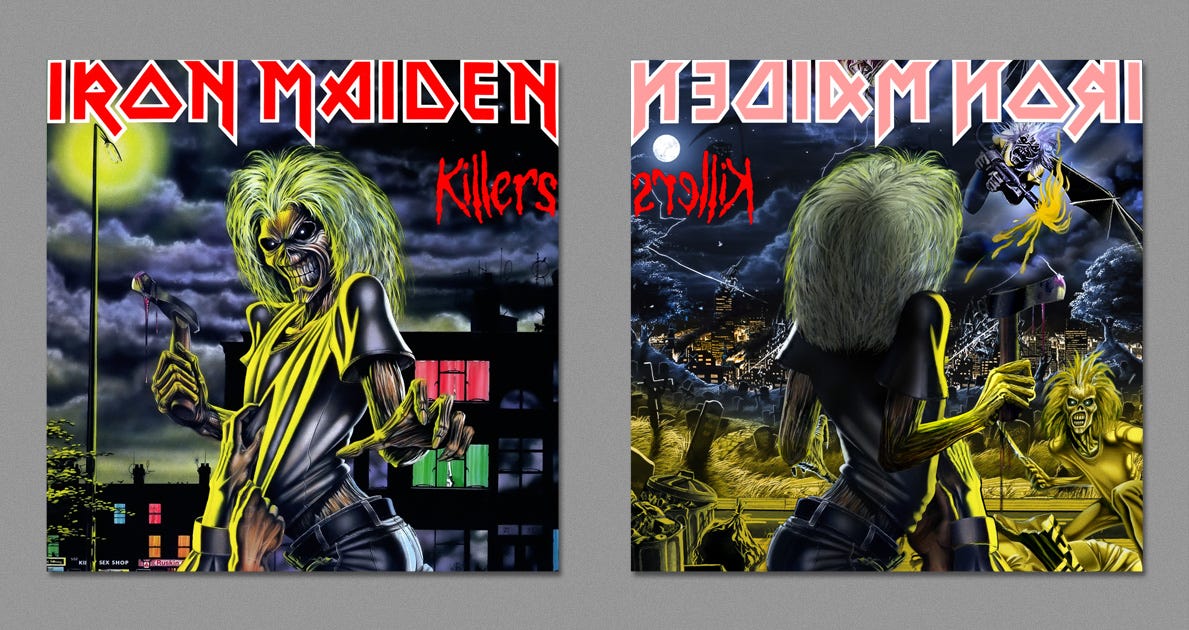
And finally, Harvezt just happened to include the very first album I ever purchased for myself: Iron Maiden’s Killers. I remember thinking about how frightening Eddie was — that he was the evil, unrepentant killer — terrorizing an otherwise calm land. But this take on it is far more captivating, portraying Eddie as a survivor in a ruinous wasteland.
Go and check out the full set of images, and thanks to Spin for putting this on my radar. Hope you enjoyed this, and if you missed any of the news from the Universe this past week, check out all our posts here and the best of our comments from the past week at our forum on Scienceblogs!
Enjoyed this? Weigh in at the Starts With A Bang forum here!


