This ringed bridge in Uruguay is awesome for so many reasons

For as long as we’ve been building bridges, the basic pragmatics of the practice have prescribed a crossing between separate swaths of land in as little time as possible. That maxim is evident in most bridges — from the itty-bitty to the large and enduring.
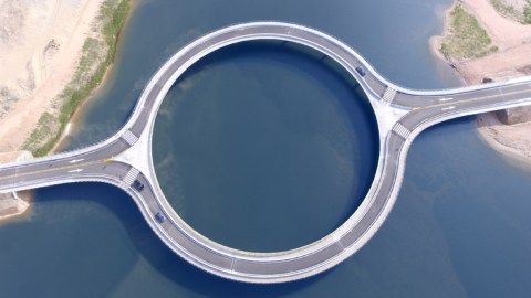
The newly constructed Laguna Garzón Bridge, located on the Uruguayan coast about 100 miles east of Montevideo, offers a different philosophy of bridge-building:
This unique circular bridge, which connects the cities of Rocha and Maldonado, was designed by Uruguayan-born, New York-based architect Rafael Viñoly and funded by an Argentine businessman with aspirations for a tourism project on the Rocha side. As you can see, it resembles an elevated roundabout intersection, just without the intersection.
According to Viñoly, the aim of the construction is threefold. First, the ring shape should reduce vehicle speeds. Second, the curved design encourages drivers to enjoy a panorama view. Finally, an inner circle walkway should attract tourist and recreational foot traffic. You have to imagine it’d make a great selfie.
If you’ve made it this far and your reaction is, “But it’s just a ring,” then there’s probably not much I can do to convince you that this is a really interesting construction. For everyone else, we’re looking at the pragmatics of bridge-building turned upside-down. Viñoly, when given the task of crossing the channel, elected to do it in a less obvious way. Economy of space was traded in for aesthetics. Straightforwardness gave way to safety. The result: a simple, unique, perhaps-iconic design that encourages our minds to rethink perceptions of what a bridge can be.
What I like most about Laguna Garzón is how it leads the mind to wonder how minor tweaks could radically change other “simple” constructions, whether it be a small home, a bike path, a telephone pole, etc. This is the brand of thinking that leads designers to rethink things like monuments and office buildings, and to push the evolution of their form.
The main takeaway: Sometimes in order to think big, you’ve got to rethink the small things.
**
Robert Montenegro is a writer and dramaturg who regularly contributes to Big Think and Crooked Scoreboard. He lives in Washington DC and is a graduate of Loyola Marymount University in Los Angeles.
Twitter: @Monteneggroll. Website: robertmontenegro.com.


