An effective new tool that makes GLOBAL climate change LOCAL

Global leaders seriously worried about climate change are having trouble getting more people to share that concern. One big reason is that climate change just doesn’t have the psychological characteristics that make risks particularly scary. It’s off in the future, and we worry more about risks that are ‘today’ than those that only threaten us tomorrow. It’s abstract, an idea more than a concrete tangible threat, which gives it less emotional resonance. (Note how that resonance rises with each new tangible episode of dangerous abnormal weather.) But most of all, climate change just doesn’t feel to most of us like it’s going to do anything seriously harmful, to us, personally.
A recent survey of public opinion, part of the series of surveys being conducted by Anthony Lieserowitz of Yale and Ed Maibach of George Mason, found that 63% of Americans think climate change is happening, but only 51% are somewhat or very worried about it, and only 38% believe they personally will be affected either moderately or a great deal. That’s pretty strong evidence supporting what Paul Slovic and Baruch Fischhoff and other researchers in risk perception psychology have found, that the less a risk feels like it threatens you, the less worried about it you are likely to be.
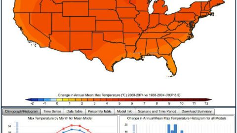
So one challenge for climate change communicators is to find honest ways to help people see what significant changes in the climate will mean to them, in personal terms. And a new tool is a step in the right direction. The U.S. Geological Survey has put together what 31 computer models tell us about how climate change will impact our local weather. Not the big global climate picture. After all, who wakes up in the morning and checks out the global climate report? We don’t ‘think globally’. We check out the local weather report. That’s what this tool provides, all the way to the year 2099.
With a few clicks, you can ask this website how the average high and low temperatures will shift, in your county, compared to the average between 1980 and 2024, for the periods of 2025-2049, 2050-2074, and 2074-2099. It will tell you how the amount of precipitation is likely to change too. And it can give you annual averages or break it down month by month. It will even tell you what the average of all computer models say, or it can show you the data from each of the 31 models it brings together. Essentially this tool offers a look at what climate change is likely to do to the weather where you live for the next 85 years. It brings the global, down to the local.
The tool (which, while a great step in the right direction is still geeky and too science/data heavy) is available here To see the data for where you live, just click on your state. I live just west of Boston. Here’s the map for the shift in high temperatures, between 2025 and 2049, compared to the average for the period between 1980 and 2004.

So where I live, starting about eleven years from now, average annual high temperatures will be about 1.5 degrees Celsius hotter than now (~ 3 degrees farenheit). The average low temperature will bottom out about 2 degrees C (~ 4 degrees F) warmer than now.
Precipitation will be about the same annually, but December and January will have more, probably more rain than snow with warmer temperatures, and September and October will have a little less.

Click to the time sequence for 2075-2099, and things get more dramatic. Massachusetts residents will face average annual temperatures 3.5 – 4 C warmer (6.3 – 7.2 F) than the average between 1980 and 2004. And from 2075 to 2099, years in which anyone born today is likely to live, average Massachusetts highs and lows will both shift upwards about 4.5 -5.5 C (8-10 degrees F). The average high in August will be above 90 F. The average low in January won’t be cold enough for snow. That map looks like this.

Is this news dire? No. Does it make me feel much more alarmed about climate change? No. Not by itself. But it starts to make an abstract problem concrete, and it starts to put a global problem into terms that are local, relevant, and familiar. And those, according to research into the psychology of risk perception, are vital emotional frames that make a risk real, real enough to care more about.
The most commonly cited challenge for climate change communication is; how do we get the non-believers to believe? That’s a different problem, with different answers. But the non-believers/doubters are a smaller group, 23% according to the latest Yale/George Mason survey, than the majorities who recognize the problem is real, but just don’t care all that much. To raise their concern, global leaders sounding the alarm about climate change should do more to apply insights from the study of risk perception psychology. This new USGS tool is a small step in that direction.


